| Image |
Comment |
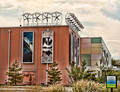
| 07/18/2012 10:12:33 AM |
Wind Powerby KelliComment: Overprocessed. Like crazy. That is all.
The biggest give away on the crazy processing here is the halos around the trees from tonemapping the image.
My suggestion for next time would be to separate the image into two halves, one the sky half, the other the ground and building, and adjust each separately, I would also suggest cutting back on the tonemapping, it's an awesome tool when used correctly, but a little goes quite a long way. :) |
 Photographer found comment helpful. Photographer found comment helpful. |
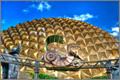
| 07/18/2012 10:09:31 AM |
Harness Energyby LanndonKaneComment: I have yet to see a good shot of this subject. Sorry, but it's a good concept, however this particular subject has almost become the unicorn of photography. |
| Photographer found comment helpful. |
| 07/18/2012 10:09:22 AM |
Electric milk frotherby hajekaComment: Hmm... Too much negative space. Mostly OOF, point of interest isn't that interesting, and the image doesn't really convey "technology"... More like "gadgetry"... |
| Photographer found comment helpful. |
| 07/18/2012 10:09:16 AM |
Techno-Freakby MondComment: Despite the cartoonish feel, the processing is actually quite well done. My question to you is "how does this convey technology to the viewer?" I don't really read "technology" in this photo... Overall it's pretty good, but borders on DNMC/snapshot. I think you'll finish towards the top of the middle. |
| 07/18/2012 10:08:51 AM |
Web Technologyby kprasad9375Comment: I see what you were trying to do. I'm fear that I must tell you though - for me, you've failed to tie the title to the image that's a ball, not a web... And the image itself isn't really telling me anything of technology. Plus its' a bit blurry.... Dunno, sorry, but this isn't doing much for me at all, despite the fact that I really, really want to like it, the thumbnail is much better than the full-size. |
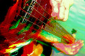
| 07/18/2012 10:04:06 AM |
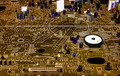
Audio Technologies: From a Single String to Millions of Heartsby unbreakableComment: I genuinely hope this ends up at the bottom of the pack.. Why in the heck would you do this to an image? The whole thing has become a eye gouging nightmare because of the processing.
The simple save here would have been to simply convert this to B&W, that would have taken away almost all of the eye-gouging aspects. I probably would have loved this as a super-low key image, perhaps if you had just cranked down the ISO and shot somewhat fast, then left me with an image of highlight and deep blacks, I probably would have preferred it... All personal preference really, but bright pinks and greens with lots of blur and grain isn't my thing. :) |
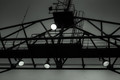
| 07/18/2012 10:00:30 AM |
Modern day watchtowerby wejnaComment: Strange. I don't know that it screams technology, but it's not bad either. My concern is the overall composition, why is this laid out like it is, why not symmetrical? Why not more context? |
| Photographer found comment helpful. |
| 07/18/2012 10:00:23 AM |
VHS City Centerby LawtonComment: I like this, sorta... Mostly my issue is that the processing is really rough - too much high-radius contrast (structure), and too much saturation/contrast. I'm afraid that the image just feels blotchy and overcooked. |
| 07/18/2012 10:00:03 AM |
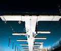
DSC_5734by daisydavidComment: So... you umm. flipped an overexposed photo of a dock 180 degrees, did some processing and submitted it? What were you trying to say? What was the idea you were trying to convey? I don't know, forgive me but I'm failing to understand the image. |
| Photographer found comment helpful. |
| 07/18/2012 09:59:57 AM |
Viewer In Healightsby VenserComment: Oh. I see. I think you've used the flash to show me something of the interior of your house and some sort of railing outside... So mostly I'm getting the flash. And what the heck is a Healight?
I suspect you may trying for a brown. I'm afraid that I must assist you in such an achievement. |
| Photographer found comment helpful. |
Home -
Challenges -
Community -
League -
Photos -
Cameras -
Lenses -
Learn -
Help -
Terms of Use -
Privacy -
Top ^
DPChallenge, and website content and design, Copyright © 2001-2026 Challenging Technologies, LLC.
All digital photo copyrights belong to the photographers and may not be used without permission.
Current Server Time: 07/26/2026 10:10:53 AM EDT.