| Image |
Comment |
| 01/30/2005 07:42:49 AM |
Mother And Daughterby tchilyanComment: Composition is great, but I think overexposuring and WB has ruined your photo. Your models are so beautiful, shame you did this to this photo. :-((( |
| 01/30/2005 07:41:03 AM |
The New Builds Around the Oldby briphotoComment: I like the composition here. :-) I would crop a few mm on the top, because the signs of rotation have remained there. I would leave more space on the bottom, a few cm because the greens would add a nice colour element to the blue and terracotta colours. Maybe a bait more saturation would help, too. Try these, and I think you will get a very nice result. :-) |
 Photographer found comment helpful. Photographer found comment helpful. |
| 01/30/2005 07:38:39 AM |
Last drop ...by andr00Comment: I don't really like the colour tones here, somewhat it reminds me to a failed WB setup, or, if it was the purpose, it dowsn't really give me the Matrix feeling. I would change your composition as well, for example a diagonal one with the keyboard, which divides your photo to two equal parts, one for old and one for new. I would choose a lower angle as well, approaching from the side of the pen. The idea is nice but could be implemented with a higher quality. |
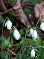
| 01/30/2005 07:37:57 AM |
New growth... thru the deadby WobbleComment: Nice idea. :-) I miss the bottom of the flowers and you lost some shades of the whites. Maybe a little bit of underexposing would have helped and then you could have helped midtones and shadows with post-processing. I know these flowers and I had some troubles last year photographing the texture too, because harsh sun made it more difficult to get the best exposure for whites and darks at the same time. I wouldn't have cropped it so tight on the right, tyou have cut off a part of that flower, but maybe I would have cropped a few cm on the top. |
| Photographer found comment helpful. |
| 01/30/2005 07:32:19 AM |
Fall Colors and Spring Blossumsby fulgentComment: Loveable lights and moody colours! :-) I especially love the light circles on the dark blue background. For me, the leaf colours doesn't really represent autumn, the new side of the subject is very much more accented, but alltogether a nice shot. |
| Photographer found comment helpful. |
| 01/30/2005 07:30:27 AM |
Can You Hear Me Now ??by lovenhate54Comment: I have the same phone type and the same provider. :-))) Great idea, though, the tilting of the table is a bit distracting, and the colour of the wall doesn't help the mood. I hided it on both sides with my hands and I got a more moody result that way. I would improve lighting as well, more diffusion for the metals, because lighting is a bit harsh on them. |
| Photographer found comment helpful. |
| 01/30/2005 07:27:50 AM |
Nostalgiaby fplouffeComment: I love creativity here! Nice composition and DOF, I would have got rid of the remain of dust and maybe it would be even more better if the front side of the CD was sharp, too. Just an idea. |
| Photographer found comment helpful. |
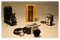
| 01/30/2005 07:25:19 AM |
A Time Not Forgottenby gwphotoComment: Sorry, but I have enough of 200*300 photos! :-( Why didn't you upload it with the largest dimensions possible (640 pixels wide)? I can hardly see a thing this way. :-( The idea is nice anyway, I like the subject chosen, photography. Composition needs a bit of improvement in my opinion, I would have put the machines a bit more together. (Rating is because of the size of your photo...) |
| 01/30/2005 07:22:48 AM |
OLD CHRISTIAN METAL & NEW CHRISTIAN METALby DieHappyComment: I like the mood of this photo, the warm brown tones with the cold grey tones. Though, the CD could be sharper, the photo needs more contrast in my opinion. Why did you upload it this small? It would be definitely more enjoyable with about 400*640 dimensions! |
| 01/24/2005 07:35:56 AM |
Boat Houseby naretComment: It seems to me that the whole house is floating on the small bridge (?) coming from the bottom left corner. :-) Simple subject and so wonderful colours, so moody and crisp. I love this one, good luck! :-) |
Home -
Challenges -
Community -
League -
Photos -
Cameras -
Lenses -
Learn -
Help -
Terms of Use -
Privacy -
Top ^
DPChallenge, and website content and design, Copyright © 2001-2026 Challenging Technologies, LLC.
All digital photo copyrights belong to the photographers and may not be used without permission.
Current Server Time: 07/18/2026 04:58:17 AM EDT.