| Image |
Comment |
| 01/30/2005 11:46:35 AM |
Rays of Sunby xcharrierComment: Expressing use of negative space, the comparative colours work well. Though, you loose some details and shades of the petals. A bit of underexposing would have helped, I think so. |
 Photographer found comment helpful. Photographer found comment helpful. |
| 01/30/2005 11:44:43 AM |
3 Great Modelsby Travis99Comment: Nice nostalgic mood. I love the sepia tones and the colours of the dolls' eyes. great models indeed, soft beauty in this world we live now. |
| 01/30/2005 11:42:58 AM |
Happy Birthday to you..by jonpinkComment: Lovely sharp photo with clear colours! I love the tilting composition and the DOF you used, and the shades of the flames. Good luck! |
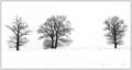
| 01/30/2005 11:41:58 AM |
Winter treesby RUEDISCHMUTZComment: I love the simplicity here. Though, I feel you loose some tones and details on the ground. If it's because of the homogenic snow, I would crop a bit to avoid or minimalize detailless areas. Just an idea, anyway, I love the mood and the composition. |
| Photographer found comment helpful. |
| 01/30/2005 09:01:29 AM |
Carrier Sunsetby tmontiComment: Oh, yes, a sunset. :-) There are too much blacks without details, and it's hard to find our what's this - anyway, sharp - silhouette exactly without the title. I can't see the implementation of the challenge, where is old and new on this photo? |
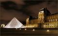
| 01/30/2005 08:56:41 AM |
Le Louvre by GabrielComment: MY ABSOLUTE FAVOURITE so far!!! So wonderfully exposed, beautiful colours and composition! I love the gold tones against the pyramids silverish tones, the classical old and beautiful architecture against the way too simple and unfriendly new, the elegant mood of this shot and the tones of the sky and ground, the long-exposured lights as stars which add a nice element to the gloom of these buildings. Stunning! I have been there, but I have never seen Le Louvre sooo beautiful...
This is my pick for the blue! Good luck, absolutely 10!!! |
| Photographer found comment helpful. |
| 01/30/2005 08:53:02 AM |
Green is always the sameby shiva5381Comment: Very nice shades and sharpness! What I don't really like, it's composition. I feel like it wanted to be somewhat a bit chaotical (cropped coins), but there are too much rules in thiscomposition: coins visible on the top in a ruled row... It's diffiult to make chaos that looks good, but I think it would help the mood. Don't misunderstand me, I think this is a nice photo, I just wonder how to make it more better. :-) |
| Photographer found comment helpful. |
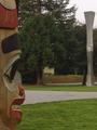
| 01/30/2005 08:48:35 AM |
Two Polesby joroComment: Great viewpoint and composition. :-) You didn't have luck with the weather, though. The photo is a bit greyish, maybe a bit contrast and saturation would help, I am not sure. |
| Photographer found comment helpful. |
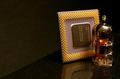
| 01/30/2005 08:47:26 AM |
Technologyby carlosComment: I would have used a square crop, I think negative space is useless here, and I would put a bit more space on the right. But, wonderful tones and colours, I love them! Getting rid of the dust would have made this one more effective and clear. |
| Photographer found comment helpful. |
| 01/30/2005 08:45:47 AM |
Modernity and the Defiant Churchby CutterComment: I would levae more space on the right, the side of the church could start from the right bottom corner. I wouldn't have deaturated the church, what colour it was? Grey? Brown? Red? Yellow? I think it would have worked well with the blues, but maybe I am mistaken. Composition is great! :-) The view, too. :-) |
| Photographer found comment helpful. |
Home -
Challenges -
Community -
League -
Photos -
Cameras -
Lenses -
Learn -
Help -
Terms of Use -
Privacy -
Top ^
DPChallenge, and website content and design, Copyright © 2001-2026 Challenging Technologies, LLC.
All digital photo copyrights belong to the photographers and may not be used without permission.
Current Server Time: 07/18/2026 01:09:20 AM EDT.