| Image |
Comment |
| 07/17/2010 11:43:31 AM |
red rectangleby browda1Comment: Variations of this theme have been done to death in different challenge topics since 2002... So it's humorous but over-used. |
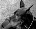
| 07/17/2010 11:40:52 AM |
Dog with rectangle headby ladpupmoeComment: Good vision... but with the other dog's butt in the photo and the placement of the majority of the subjects face in the lower middle of the frame, it just sort of feels like you took the shot without considering any compositional aspects of the photo. |
 Photographer found comment helpful. Photographer found comment helpful. |
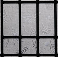
| 07/17/2010 11:38:25 AM |
The Grieving Windowby theraindewComment: Good texture. Meets the challenge. Due to the overwhelming greyness of it all it sort of lacks interest for me. |
| Photographer found comment helpful. |
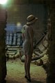
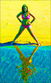
| 07/17/2010 11:36:58 AM |
On Tiptoeby apergamentComment: It appears there are some focusing and sharpness issues here, but then again it could be on purpose for arts sake... (sorry art!! lol)
I don't think the lens flare adds anything to the picture and the white balance is definitely something I am not used to seeing... This photo just confuses me apparently! |
| Photographer found comment helpful. |
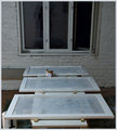
| 07/17/2010 10:52:22 AM |
3 ventilating doorsby raishComment: The photo meets the challenge by depicting rectangles. I think it suffers from being underexposed. It could be composed better to add some interest. It looks like you took a shot of your hard work of the day to show your pride of accomplishment! |
| Photographer found comment helpful. |
| 07/16/2010 09:43:45 AM |
|
| Photographer found comment helpful. |
| 07/16/2010 09:41:29 AM |
|
| Photographer found comment helpful. |
| 07/16/2010 09:41:06 AM |
Frameby kprasad9375Comment: The natural frame using shadow to frame the light is awesome... the added border really kills this fine photo!! |
| Photographer found comment helpful. |
| 07/15/2010 09:17:40 PM |
|
| Photographer found comment helpful. |
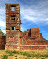
| 07/15/2010 05:15:35 PM |
Medieval Ruinby MarstonComment: Great color and texture. I'll bet it was difficult to downsize this file and get good sharpness! I like the deep red bricks against the sky. If there is anything to change it might be to just get a detail of the ruin instead of the whole thing. I would suggest framing just a perspective shot of that tower. It might have more effect for this challenge. Overall a good shot with vivid color and sharpness! |
| Photographer found comment helpful. |
Home -
Challenges -
Community -
League -
Photos -
Cameras -
Lenses -
Learn -
Help -
Terms of Use -
Privacy -
Top ^
DPChallenge, and website content and design, Copyright © 2001-2026 Challenging Technologies, LLC.
All digital photo copyrights belong to the photographers and may not be used without permission.
Current Server Time: 06/23/2026 05:54:05 AM EDT.