| Image |
Comment |
| 05/23/2011 08:59:21 AM |
Yellowby bobccComment: Good composition. It's a little bit dark and I would like to see a little more shutter used to allow some more light in. |
 Photographer found comment helpful. Photographer found comment helpful. |
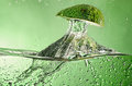
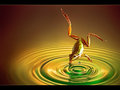
| 05/23/2011 08:58:36 AM |
Avo-'Qua-Doby AllenPComment: This needed a more central composition. The avocado is too high in the frame for my liking. My eye rests on the entry point of the avocado in the water where the big part of the splash is. |
| Photographer found comment helpful. |
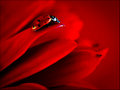
| 05/23/2011 08:56:18 AM |
Lady in Red by Ja-9Comment: The contrast and saturation of the red color give this a more sultry, seductive look. It did however serve to make the ladybug look glassy and sort of unnatural. Still gets high marks in my book. |
| Photographer found comment helpful. |
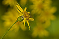
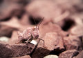
| 05/23/2011 08:54:14 AM |
antecygnumby posthumousComment: It's a cute subject. I am not really a fan of the processing though... I know in my mind that the photo is yellow on green and the color overlay does not really change that. |
| Photographer found comment helpful. |
| 05/23/2011 08:51:12 AM |
Diving by william88Comment: Superb! The frog is reflecting the light which helps match it the background. |
| Photographer found comment helpful. |
| 05/23/2011 08:50:18 AM |
|
| Photographer found comment helpful. |
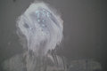
| 05/23/2011 08:49:41 AM |
found self portraitby bvyComment: Great find and awesome interpretation. The shot itself is lacking depth due to it actually being two dimensional. A little better lighting could help spruce this up a touch. |
| Photographer found comment helpful. |
| 05/23/2011 08:45:53 AM |
Shot Through the Heartby aj1621Comment: Very nice use of vignette to create the focus point. It may be slightly overdone... I think the sand needs a bit more detail to bring out the texture some. Overall though a good solid shot and good use of white on white. |
| Photographer found comment helpful. |
| 05/23/2011 08:44:33 AM |
Another Wine Class Shot (with my favorite knife)by PetRockComment: Interesting colors from the reflected light... The shot is slightly tilted and the knife doesn't really add interest. It is just out of place. The symmetry has been lost with the placement of the outer glasses. I do love how the knife has a wild gradient formed on it though! You did manage to get some nice light on the stem of the wine goblet. |
| Photographer found comment helpful. |
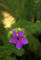
| 05/18/2011 07:35:20 PM |
Pink Five Petalsby ArjComment: Nice color and exposure. I just think there is a lot of wasted space at the top of the frame. |
| Photographer found comment helpful. |
Home -
Challenges -
Community -
League -
Photos -
Cameras -
Lenses -
Learn -
Help -
Terms of Use -
Privacy -
Top ^
DPChallenge, and website content and design, Copyright © 2001-2026 Challenging Technologies, LLC.
All digital photo copyrights belong to the photographers and may not be used without permission.
Current Server Time: 06/26/2026 11:42:07 AM EDT.