| Image |
Comment |
| 06/10/2011 08:56:21 AM |
|
 Photographer found comment helpful. Photographer found comment helpful. |
| 06/10/2011 08:55:56 AM |
My friendly neighborby lobrinComment: This photo along with the title kind of makes me think you caught this person in the act of doing something wrong... searching through your garbage perhaps?? |
| Photographer found comment helpful. |
| 06/10/2011 08:51:28 AM |
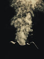
Moving on...by herfotomanComment: This is a good blur shot but you can't really tell if it is night or day. You got a good silhouette though. I can just give the benefit of the doubt. It looks like it is a performer on stage though and wasn't really shot outside. |
| Photographer found comment helpful. |
| 06/10/2011 08:49:01 AM |
I am NOT talking to youby pambComment: Very great nice color and lighting. I think you could have used a little faster shutter speed as the center part of the photo looks slightly bright. I definitely would have gotten closer too. Make the girls silhouette a bigger part of the picture. |
| Photographer found comment helpful. |
| 06/08/2011 11:53:55 AM |
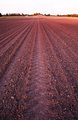
Barrenby stantheman1313Comment: The blown out sky at the end leaves me wanting more. The field has the golden sunkiss of evening light, yet the eye travels to that blank, white sky.
eta: I just came back to visit this and rethought the picture. If I evaluated the picture for leading lines only, the white sky would act as a stopping point. But as a representation of minimalist art, I can break it down into it's fundamental parts a little more... red field with vertical lines, thin strip of landscape, white horizontal sky. I can bump up my score a bit for that. |
| Photographer found comment helpful. |
| 06/08/2011 11:38:58 AM |
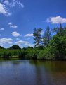
The Sky Above, Water Belowby fldaveComment: This is a nice capture that is very well exposed. Compositionally, there doesn't seem to be any real subject to the scene. What are you trying to show me about this landscape. It seems to be all background with no real focal point. You got a fairly rich color in the sky. One thing that could have helped would be to use a polarizer. It might have cleared up the murky water. |
| Photographer found comment helpful. |
| 06/08/2011 11:38:55 AM |
Green and pleasant landby WobbleComment: The color is somewhat lacking in luminosity. Even with a foggy day, there should be some light captured. This seems underexposed. You have captured the subject earthwork well, but with the large focal length, the vast openness of the landscape is not shown, which is a key element of composition in a minimalist landscape. |
| 06/08/2011 08:49:15 AM |
Michigan Cityby LN13Comment: I like this photo. You got a nice high average score for this site. 5.6889 to me means people liked it but it still needed something. I really liked the composition, the lighting is spectacular, the pigeon is an added bonus and really, the horizon seems just above center, though not quite conforming to the rule of thirds. I think the saturation is decent. Possibly a little less could have worked better. The contrast is a little heavy in my opinion.
What could have made it better? Well a longer shutter speed to smooth out the water of course. Compare this photo to your personal best photo and notice the difference...
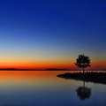
Your PB has the same saturation but is softer due to a longer exposure. The water is like glass and shows off the reflection well. Hope my comments helped. |
| Photographer found comment helpful. |
| 06/08/2011 08:39:58 AM |
Sunset Kissby malenurse1979Comment: Originally posted by LydiaToo:
LOL! I see woman/man here... He's got his hand on her bottom and her hand is clinched, fingers into almost a fist...
Body Language. *sigh*
(not voting) |
Nice observation... There's a definite gap between the two of them. He's leaning in to kiss her but still keeping his distance and she's kind of pushing him away. |
| 06/08/2011 08:34:39 AM |
Learning to Hateby klockyaComment: It's a little dark... but the message is good. Message edited by author 2011-06-08 08:35:03. |
Home -
Challenges -
Community -
League -
Photos -
Cameras -
Lenses -
Learn -
Help -
Terms of Use -
Privacy -
Top ^
DPChallenge, and website content and design, Copyright © 2001-2026 Challenging Technologies, LLC.
All digital photo copyrights belong to the photographers and may not be used without permission.
Current Server Time: 07/17/2026 01:58:05 AM EDT.