| Image |
Comment |
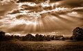
| 06/27/2011 01:30:01 PM |
And The Heavens Openedby mefnjComment: I have been looking up to the sky a lot these days seeing the wonderful light that streams from behind the clouds. I love your capture here and am jealous because I can't make it work. I want to know your secrets and I will be checking out this image at the end of the challenge to ask you about it. Hopefully you will share some tips! |
 Photographer found comment helpful. Photographer found comment helpful. |
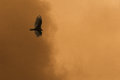
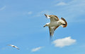
| 06/27/2011 01:26:54 PM |
Sin Overruns the Empireby cloudsmeComment: Such a captivating title goes well with the image. The darkness overtaking the light, led by the bird in flight. What great storytelling imagery and such awesome symbolism! To me the technicals are good, but the storyline gets all the marks on this work of art!! |
| Photographer found comment helpful. |
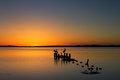
| 06/24/2011 04:35:17 PM |
The Old Wharf..... 5 Years Laterby StagoleeComment: Wow, looks like the sea level is about 6 inches higher! Anyway, fantastic redo. Such greater clarity and composition. Your previous photo left me feeling boxed in because of the line of the wharf leading to the left and the focal point of the sunset to the right. Here, the sunset is in a much better position and the lines point right to it. It gives a much better sense of open space! Well done! |
| Photographer found comment helpful. |
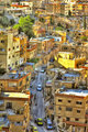
| 06/24/2011 01:35:38 PM |
An abstract of a neighborhoodby HighNoonerComment: A photographer I admire and an image I remember without having to look it up. I like the new crop on this shot and the warmer colors. The leading line from the zig-zagging wires really takes you through the street to the end. In your last shot, the scene felt somewhat cut off due to the square crop. One thing I miss about this shot from the other one is the details. Being so close up in the other shot brought me more into the scene. That is a matter of the site image size restriction though. Surely this is a bigger image and if you had the same width as before, this shot would be just as spectacular. Overall a nice improvement I would just like to see it bigger, but that does not affect my vote. |
| Photographer found comment helpful. |
| 06/24/2011 01:23:50 PM |
Soaring IIby EnlightenedComment: There are so many images titles "Soaring" I couldn't begin to come up with what this shot is a re-take of, so I can't offer any good comments regarding your update. It does show good movement which adds to the dynamic of the photo. Good use of rule of thirds too. I think it would have been better to get the bird flying solo without another in the sky. But other than that, the lighting is real good with the underside of the bird being lit real well even though it is in shadow. |
| Photographer found comment helpful. |
| 06/24/2011 01:07:23 PM |
-Selective Desaturation Challenge-by sfaliceComment: I think this is a reshoot of an entry by  sfalice sfalice. I must say you have really improved the image tremendously. The full color and the saturation really pops. It looks like something out of a '50's technicolor movie or something! I also think you may have tried some perspective correction because the columns in your last entry look somewhat curved and these look nice and straight... Great Job.
One of the few critiques I could give is about the dark water. Other than that... It Pops!! |
| Photographer found comment helpful. |
| 06/24/2011 08:30:45 AM |
Missing youby sinistral_leoComment: Nothing really improved on this shot. The added blackness really doesn't help. I think you should have gone and re-shot your bees in the back yard again! |
| 06/24/2011 08:26:51 AM |
Rosie The Riveterby sjhulsComment: Definite improvement over your first photo. The lighting is much better. I noticed how you got some shadow on the front of your forearm, like in the poster which suggests you used good side lighting from camera right. The sharpness is uber on this take! I like your take on this subject and I can't offer any improvements. I can offer alternatives because there are always a thousand ways you can do one thing. Some alternatives to try in your processing might be to add some noise or a bit of soft focus to the image. When I look at the poster images, the use of the printing technique seemed to give some speckling to the poster, which is why I suggested noise. Also in the poster, Rosie still gave off that feminine mystique so I think maybe some soft focus might aid in that in your shot. Also I thought it might make it more true to the era rather than the HD shot you have here. Just suggestions though, not real critiques. |
| Photographer found comment helpful. |
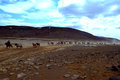
| 06/18/2011 04:06:42 PM |
Let the horses run.by AomarComment: Awesome foreground but the sky is a major problem on this shot. I don't know what you did with it... The light of the sky nd the light of the ground don't match. I suppose you tried to blend using expert editing. Other than that, the line of horses, the dust, that was done very well. |
| Photographer found comment helpful. |
| 06/17/2011 09:01:20 AM |
|
| Photographer found comment helpful. |
Home -
Challenges -
Community -
League -
Photos -
Cameras -
Lenses -
Learn -
Help -
Terms of Use -
Privacy -
Top ^
DPChallenge, and website content and design, Copyright © 2001-2026 Challenging Technologies, LLC.
All digital photo copyrights belong to the photographers and may not be used without permission.
Current Server Time: 06/26/2026 01:29:37 PM EDT.