| Image |
Comment |
| 08/18/2011 03:29:39 PM |
Clock of the tideby BrinComment: Another good take of a similar subject. I kind of like the brighter light on the other picture. But the muted colors here are cool. I do like the other photo using the rule of thirds better than this one which has filled more of the frame with the subject. Good job on the textures and I like the gradient sky! |
 Photographer found comment helpful. Photographer found comment helpful. |
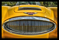
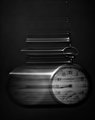
| 08/18/2011 03:25:55 PM |
Timeless Classicby cryanComment: The window and the rest of the upper part of the picture is not really needed here. Otherwise awesomely sharp and very crisp chrome! Great color without being cartoony! |
| Photographer found comment helpful. |
| 08/18/2011 01:29:15 PM |
|
| Photographer found comment helpful. |
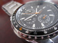
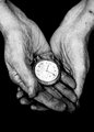
| 08/18/2011 01:25:32 PM |
Every second countsby littlemrshComment: Really great, even lighting on the glass face! Awesome job on that. There are many reflections in the watch case which is ok, but I would like to see it cleaner. Not possible without a light tent I know!! So for use of open natural light, you did a great job. |
| Photographer found comment helpful. |
| 08/18/2011 01:23:06 PM |
Time Will Always Have It's Sayby ferrissComment: Decent perspective shot here. However it does suffer from lens distortion. Also the exposure is great for the foreground but leaves lots to be desired for the sky. It is washed out and white. |
| Photographer found comment helpful. |
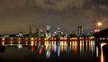
| 08/18/2011 08:52:23 AM |
Time = motionby HarlequinComment: I am not getting the sense of motion from this picture unless it is represented by that yellow line above the lights on the shoreline running from right to left and stopping about mid frame. Otherwise it is a very well done city night shot!! But movement is not highlighted very well. |
| Photographer found comment helpful. |
| 08/18/2011 08:50:23 AM |
|
| Photographer found comment helpful. |
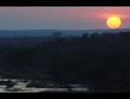
| 08/18/2011 08:49:45 AM |
Time Fliesby franktheyankComment: I think I would have liked a landscape orientation better. But as it stands, very good job on the motion blur and the exposure! |
| Photographer found comment helpful. |
| 08/18/2011 08:48:00 AM |
Landscape Photographers - Right Place Right Timeby HarveyGComment: Right place, right time, wrong exposure! You got the sky exposed so well but the foreground is so dark. I can't make out any details. You really needed to bracket your exposures and blend in post. Or else use a gradient layer to brighten up the foreground and mask out the sky... |
| Photographer found comment helpful. |
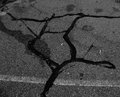
| 08/18/2011 08:44:10 AM |
Decay of 1927by geinafetsComment: The photo is very well processed and emotive. The title detracts from the emotion felt. But I am voting on the picture and not the title in this case because the title is not being used to shoehorn the photo into fitting the challenge. |
| Photographer found comment helpful. |
Home -
Challenges -
Community -
League -
Photos -
Cameras -
Lenses -
Learn -
Help -
Terms of Use -
Privacy -
Top ^
DPChallenge, and website content and design, Copyright © 2001-2026 Challenging Technologies, LLC.
All digital photo copyrights belong to the photographers and may not be used without permission.
Current Server Time: 06/25/2026 01:10:36 AM EDT.