| Image |
Comment |
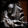
| 12/19/2011 08:26:06 PM |
Bronzeby JuliBocComment: I like that it is all brown, including the background. Good eye for simplicity in the shot. It is fairly soft in focus due to camera shake or missed focus. More than likely it was missed focus due to the autofocus not functioning because of the ingle color and lack of any good contrast. |
 Photographer found comment helpful. Photographer found comment helpful. |
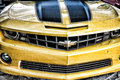
| 12/19/2011 08:23:58 PM |
My Favorite Kind of Metal by neenee1999Comment: It's a kind of gritty shot which is ok to me. I like how the yellow stands out so much. It does suffer from either oversharpening or bad resizing as shown by the jpg artifacts along practically every line on the car. |
| Photographer found comment helpful. |
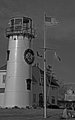
| 12/19/2011 08:21:46 PM |
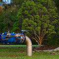
Metal Flag Poleby whiterookComment: A nice coastal type scene. Though the flag pole is metal, it is shot in a way that does not make that fact stand out as the purpose of the shot. As far as the B&W, it is lacking in tonal range consisting mostly of mid tones. The halo-ing also suggests over sharpening was performed. |
| Photographer found comment helpful. |
| 12/19/2011 12:30:44 AM |
Iconic Copperby louinsdComment: Standard shot of the statue without any added interest such as colors in the sky, sunrise/sunset, etc. Nice use of the telephoto to show of the detail but the detail was lost in the lack of sharpness. |
| 12/19/2011 12:20:06 AM |
|
| Photographer found comment helpful. |
| 12/19/2011 12:16:49 AM |
Where Man Meets Natureby BrianRComment: It looks like your slow shutter speed captured some movement in the trees making the background look as though it is an oil painting. That contrasts with the foreground which is nicely lit and in focus with no movement. I like that you kept the entire tree in the picture, but it does take the spotlight away from the subject metal. |
| Photographer found comment helpful. |
| 12/19/2011 12:13:27 AM |
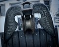
Anchorby bdshortComment: The slight tilt adds a bit of interest. The darker background doesn't do too much to add to the focal point of the subject. (To me it looks like the background was made artifically darker.) |
| 12/16/2011 09:14:07 PM |
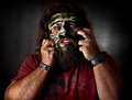
Dead Skin Mask - Slayerby MinsoPhotoComment: Mr. Minso, I can see your growth over the last few entries... getting stronger! Nice job! On this one, I think the brush work to blur the background is a little sloppy on the edges. The blur bleeds onto the shoulder line and hair (which is the completely unavoidable!!) The eyes and the mask are awesome!! |
| Photographer found comment helpful. |
| 12/16/2011 07:43:44 PM |
|
| Photographer found comment helpful. |
| 12/16/2011 07:42:28 PM |
|
| Photographer found comment helpful. |
Home -
Challenges -
Community -
League -
Photos -
Cameras -
Lenses -
Learn -
Help -
Terms of Use -
Privacy -
Top ^
DPChallenge, and website content and design, Copyright © 2001-2026 Challenging Technologies, LLC.
All digital photo copyrights belong to the photographers and may not be used without permission.
Current Server Time: 06/22/2026 10:44:08 PM EDT.