| Image |
Comment |
| 08/05/2002 05:36:00 PM |
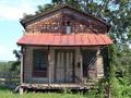
General Storeby MaYzComment: it is old, isn't it. nice find. i'm not sure about the positioning of the house in the middle of the photo. i think i would have tried to position it all the way to the left (maybe even cropped off the edge) to get rid of that blank bit of sky on the left and to include more of the trees and such on the right). -- gr8photos (6) |
| 08/13/2002 10:43:00 AM |
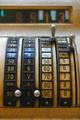
Cash onlyby chakkobboComment: no way, taken in stockholm?? that's my favorite place ... i used to live there. were you visiting over there? i don't recall ever going into a 711 that had a cash register like that, but then, i wasn't really into photography back then, either. :) |
| 08/08/2002 04:36:00 PM |
Cash onlyby chakkobboComment: very nice and old. perfect for the challenge. like the DOF, too, but i think i would've moved the $ levers so they weren't both looking like dots. also, was there a way of either not cropping of the edge of the display (i don't know how long it was) or maybe something of the $10 scale to make it look more intentional? -- gr8photos (6) |
| 08/05/2002 05:12:00 PM |
The old Grand Falls Bridgeby JackoComment: is that the side of the bridge or is there really nothing but the sides left? i like the angle, and the blue sky and clouds. nice. -- gr8photos (7) |
| 08/07/2002 12:11:00 PM |
Everlasting Beautyby BaldurComment: nice capture of old. i like how the statue is framed by the leaves, but not much obscured. -- gr8photos (8) |
| 08/06/2002 03:41:00 PM |
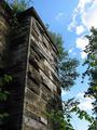
rampartby zacowacoComment: this is a pretty cool old building, i like the angle you chose and how the plants frame your photo. -- gr8photos (6) |
| 08/06/2002 10:05:00 AM |
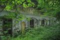
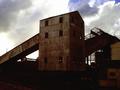
Old Power Stationby lisaeComment: this image looks very dark on my computer, i can barely make out the detail on the right side of the building and the bottom is pretty much black for me. the building was a good subject to pick, but i'm not to thrilled with its placement right in the middle of the shot. maybe more too one side ... -- gr8photos (3) |
| 08/08/2002 04:33:00 PM |
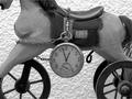
Time Passagesby GotchaComment: nice contrast (so important for a b&w shot) and nice old objects. i'm not sure about cropping off the horse's head though, what would this have looked like with the head in but maybe not the back and/or wheels? what's the connection between the watch and the horse? -- gr8photos (6) |
 Photographer found comment helpful. Photographer found comment helpful. |
| 08/05/2002 05:13:00 PM |
Preludeby ShiiizzzamComment: nice idea, good angle, focus is fine, but the shot needs to be leveled, that's quite distracting here. -- gr8photos (5) |
| 08/05/2002 12:01:00 PM |
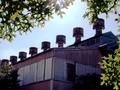
Remnantby KarenBComment: i like the chimneys (or whatever they are) all lined up on the top. the sunshine is a little too strong, even though it creates nice patterns on the overlapping leaves, but that leaves the main object (the building) dark and not as much the focus of the shot as it should be. -- gr8photos (5) |
| Photographer found comment helpful. |
Home -
Challenges -
Community -
League -
Photos -
Cameras -
Lenses -
Learn -
Help -
Terms of Use -
Privacy -
Top ^
DPChallenge, and website content and design, Copyright © 2001-2026 Challenging Technologies, LLC.
All digital photo copyrights belong to the photographers and may not be used without permission.
Current Server Time: 07/22/2026 12:33:32 PM EDT.