|
|
|
Showing 701 - 710 of ~1569 |
| Image |
Comment |
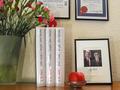
| 10/14/2002 03:50:00 PM | Pretentious ? .. Moi ?!by marcvgComment: first impression -- total laughter. and more and more nice touches like the apple. and the author's name. as well as john's of course... just great :) challenge -- met, in a very creative way technical -- ok composition -- not sure i get the flowers. did you want to make sure you had a flower shot? anyway, the whole picture looks a little too static for my liking, with everything kinda square. overall -- 8 from gr8photos |
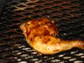
| 10/14/2002 10:33:00 AM | glut on thisby rocketmanComment: challenge - met, good idea technical - the focal point seems to be behind the piece of chicken, the chicken itself is blurry. composition - it often works better to not have the main object in the center of the photo, and to either crop off bigger parts or nothing at all. just the tip of the bone to the left looks accidental. 3 -- gr8photos |
| 10/18/2002 12:26:00 PM | Greedy Handsby GinaRothfelsComment: first impression -- this could be vanity as well as greed. rings on ringfinger look too tight, almost painful. maybe that was your intention? challenge -- met technical -- good. some hotspots from reflections but i doubt that was avoidable, and they are not too distracting. composition -- the ring on the lower hand (with the face) is kind of destracting here. i think this would've worked better with just one hand, or no rings on the lower hand. overall -- 6 from gr8photos |
| 10/18/2002 12:23:00 PM | Envyby spankyComment: first reaction -- definitely laughter. very funny! w/out the title, i would've thought this was wrath, not envy. challenge -- met technical -- having your subject stand further away from the wall would avoid the flash shadow. good skintones, nice and sharp. composition -- good use of negative space. did you consider green facepaint to make it look more like envy? overall -- 6 from gr8photos |
| 10/14/2002 04:18:00 PM | Affectionby GorpieComment: initial reaction -- don't like the title ... i'm assuming you are going for 'lust', to me, affection is something different. but then, this is a photo challenge, not a title challenge, so that doesn't change my vote. challenge -- met technical -- i'm positive you blurred this one deliberately, but it doesn't work so well for me. composition -- there's something in the corner that looks as if it is sticking out of the guy's head. i'd love to be able to see a little more of the faces, too. the curtains go well with the overall colors of the photo, good choice. overall -- 3 from gr8photos |
| 10/14/2002 12:08:00 PM | Wrath of Defeatby alexiegaComment: challenge - met technical - i'm wondering why you inverted the colors here, don't really get the point i guess. composition - i like how you placed the two chess pieces, but i would personally have preferred a simpler background. what is that thing in the back? i would've probably removed it, unless there's some significance attached to it that i'm not getting. also, the shot needs a slight rotation to the left to be level. 5 -- gr8photos |
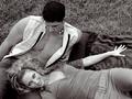
| 10/14/2002 11:02:00 AM | Seductionby AleciaComment: challenge - met technical - good tonal range, b&w works here composition - two things strike me ... the fact that the girl is looking straight at the camera and not at her seducer, and her left harm with the hand spread like that looks a little tense and awkward. i would also prefer to se the blanket covering the whole visible ground, the grass is just a little distraction for me. other than that, i like the positioning of the two of them in the grame, and the way he is looking down on her. well done. 7 -- gr8photos |  Photographer found comment helpful. Photographer found comment helpful. |
| 10/14/2002 10:50:00 AM | The gluttony-sloth cycle, a lifestyle.by jjbeguinComment: first impression - cute dog, awful looking room. which i suspect is exactly what you wanted to achieve :) challenge - met technical - good. just a very slight tad overexposed on some small parts of the fur, but i know how difficult black or white fur is to shoot, so well done. composition - ok. did you try an alternative by eliminating more of the foreground and including more of the wall? i like the space around the dog because it adds to the photo, at the same i would like to see the dog more in the foreground (i think) 6 -- gr8photos | | Photographer found comment helpful. |
| 10/18/2002 12:36:00 PM | lust for saleby shutterflyComment: first impression -- this looks like wonder in wonderland with shorter hair. mag99, is this your shot? love the angle and how the bed and money looks high-key while the girl doesn't. challenge -- met technical -- well done, some uneven light on the wall (right side melts into the bed, left has definite difference in color) but overall great composition -- very nice with the unusual angle from above and her turning back to look up. wish she wasn't wrinkling her forehead like that, but that's nitpicky. overall -- 8 from gr8photos | | Photographer found comment helpful. |
| 10/14/2002 12:24:00 PM | Greedy Pigby jedipooComment: first impression -- i could've sworn this was a dog, not a pig ;) picture made me laugh. challenge -- met technical -- good composition -- i like the low angle you've chosen and the very clean black background. well done. overall -- 7 from gr8photos |
|
Showing 701 - 710 of ~1569 |
Home -
Challenges -
Community -
League -
Photos -
Cameras -
Lenses -
Learn -
Help -
Terms of Use -
Privacy -
Top ^
DPChallenge, and website content and design, Copyright © 2001-2026 Challenging Technologies, LLC.
All digital photo copyrights belong to the photographers and may not be used without permission.
Current Server Time: 07/23/2026 12:15:45 PM EDT.
|