| Image |
Comment |
| 11/14/2002 12:54:00 PM |
Home Studiesby jjbeguinComment: challenge -- met technical -- very good lighting, i like that you have a limited range of colors but a large range of tones. very nice. composition -- love it. this tells such a nice story, there are so many things to look at, and that connect ... just perfect. the only thing that i don't like (and this is minor) is the pencil. it looks too new and the lines on it are a bit distracting. -- gr8photos. |
 Photographer found comment helpful. Photographer found comment helpful. |
| 11/14/2002 12:44:00 PM |
Blue Waterby joshuazhangComment: challenge -- met ... i think. i can't really tell, there's nothing to suggest scale. i can only assume that these are fat droplets or something. i'll be curious to find out on monday. technical -- overall just a bit too unsharp and grainy for my taste. not knowing what it is i don't know whether that's reasonable or not. composition -- i like the positioning of the circles in the otherall frame. -- gr8photos. |
| 11/12/2002 01:44:00 PM |
Chinese Miniatureby DigiPiqueComment: challenge -- met. technical -- the miniature doesn't look 100% sharp on my monitor. what are the dots in the background? i like the even black, but the specs are slightly distracting. composition -- very nice with that tree on the left 'towering' over the pagoda. -- gr8photos. |
| 11/11/2002 10:13:00 AM |
Unzippedby JMSComment: plagiarism is the sincerest form of flattery, right? i saw your photo on DPN on sunday (congrats on the POTD btw) and thought 'wow, this would be great for the DPC challenge this week', so i copied it. didn't realize you would be entering, too, most people don't show their photo until voting is over. sorry & good luck, you have a great shot here! :) |
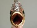
| 11/14/2002 11:41:00 AM |
Jawsby jclark20001Comment: challenge -- met technical -- the whole picture is slightly blurry. i'm assuming you used a tripod, if you didn't, it's always a good idea to do so. if you did, did you get too close for your camera to be able to focus? composition -- centering the fish works well here, i think a portrait would've been good, too, to cut down on the empty space and include the fins of the fish. -- gr8photos. |
| 11/12/2002 02:44:00 PM |
All work and no playby brianedenComment: so, how many comments have you got about this not being a macro? ;) challenge -- met. although it would've seemed much more close up and personal in my opinion if he was looking into the camera. technical -- overall very muted colors, maybe that's what you were going for. dark shadow on the left is ok, since the eye still gives structure to the darkness (does that make sense?) composition -- i don't like how he seems cropped off just under the chin. did you try a portrait format? that would still allow the background but maybe wouldn't make the crop quite as awkward. -- gr8photos. |
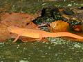
| 11/13/2002 11:03:00 AM |
Orange Juliusby goodeye22Comment: challenge -- met. the leaves give a nice sense of scale to this photo. technical -- doesn't seem to be quite a sharp as it could be ... have you saved this at a higher resolution? composition -- i like the orange and green shades of this photo. at the same time, the lizard blends into the background a bit more than i would like to see. guess i can't have both :) -- gr8photos |
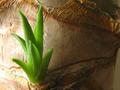
| 11/11/2002 04:31:00 PM |
Yukkaby JamieWillmottComment: challenge -- met. the trunk of the yukka gives a good sense of perspective. technical -- the focus isn't quite right, that's the hardest thing with macros. i would also prefer more even lighting, but that's probably a personal preference. i like the green of the shoot against the brown of the trunk. composition -- good placement of the shoot in the overall frame. did you try this in a vertical format at all? the shoot feels somewhat closed in because it's so close the the top and bottom of the frame. -- gr8photos |
| Photographer found comment helpful. |
| 11/14/2002 01:42:00 PM |
Winter Kissesby ASUuserwriterComment: challenge -- met technical -- the image doesn't look 100% sharp to me, maybe it's just the light reflections. tough one to reduce them on the shiny wrappings, i know. composition -- i like that you've almost filled the frame with the kisses and that some are cropped at the edges. i would try to totally hide the basket, but that's probably just me. -- gr8photos |
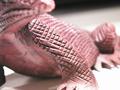
| 11/12/2002 11:39:00 AM |
Komodoby heartsdivideComment: i bet you are having a hard time competing with the real lizards and frogs. but nice subject anyway. challenge -- met. although, there's nothing in the photo that gives me an indication of actual size (this sculpture could be huge) i will give you the benefit of the doubt. technical -- since macro only allows a shallow DOF on digicams, i think you've chosen your focus nicely. i wonder if you get comments that the face should be in focus. i like it as it is. there are some highlights, especially on the foot that is in focus that are a little distracting and i'm not sure about the background going from white to black, but that's just my personal preference. composition -- nice cropping. -- gr8photos. |
Home -
Challenges -
Community -
League -
Photos -
Cameras -
Lenses -
Learn -
Help -
Terms of Use -
Privacy -
Top ^
DPChallenge, and website content and design, Copyright © 2001-2026 Challenging Technologies, LLC.
All digital photo copyrights belong to the photographers and may not be used without permission.
Current Server Time: 07/22/2026 07:13:02 PM EDT.