|
|
|
Showing 641 - 650 of ~1569 |
| Image |
Comment |
| 11/13/2002 10:36:00 AM | notes in black and whiteby birkirComment: challenge -- met technical -- b&w definitely works for a piano. i would prefer if your focal point was not at the 'end' of the picture on the right but more in the front. backing away from the piano a little bit would allow you to have that as well as the same angle. i would also like to see less reflection on the black keys in the front. composition -- very nicely done. i like how the lines run through the photo. -- gr8photos. |
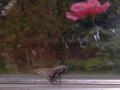
| 11/12/2002 01:37:00 PM | Death Trapby coeurdusucreComment: ugh, poor thing. challenge -- met. technical -- could you have gotten closer to the fly with your camera or by cropping? if not, fine. if yes, i think it would've benefitted the photo by focusing the viewer more on the fly. composition -- the flower in the background is the brightest bit of color in an otherwise very muted photo, and distracts a lot from your subject. the scratches in the glass do, too, to some degree. -- gr8photos. |
| 11/11/2002 11:17:00 AM | A Clam By Any Other Name...by AntithesisComment: challenge -- met technical -- very good composition -- i don't like the white shirt, and how it is cropped off, but that's probably just me. would i hang it on the wall -- no -- gr8photos |
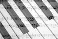
| 11/11/2002 03:41:00 PM | Notesby SSonnentagComment: i really mean to be voting all pix in the order they are presented to me ... but this one keeps on drawing me to open it up ... it's such a nice non-ghostly use of the double-exposure. challenge -- met. technical -- just right. my only very minor nitpicks are that the sheet of music is not 100% level. i would also have moved it a little more to the left so that the lines run all the way through the shot instead of showing the beginning of the music on the left. composition -- the horizontal music and the diagonal piano keys just complement each other so well, it's very pleasing to the eye. -- gr8photos. |
| 11/15/2002 06:13:00 PM | Close To My Heartby BigSmilesComment: challenge -- met. nice title btw. technical -- you did well controlling reflections that are so easy to get in these kind of pictures. the beads on the chain to the left are just a tad soft, but not very distracting, so i wouldn't worry too much about it. composition -- i am puzzled what made you use the gems as a background. overall it makes the image very busy IMO. did you try taking a pic of the chain actually around your neck with your skin as the background? i know that's a totally different picture, but (for me) that would tie the background in more with the subject. you have a decent picture regardless. |
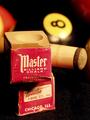
| 11/11/2002 06:12:00 PM | Chalk Up&Rack Um'by justineComment: challenge -- met ... the billiard cue adds a nice sense of scale. technical -- lighting's really good. there's a little bit of a reflection on the 8-ball but i suspect that was unavoidable and it's not much of a distraction either. composition -- i like the 'random' stacking of the chalk blocks. would like to see the bottom one fully in focus, too, but that's probably already the full DOF the camera allows for macro shots, right? did you try a green background at all to suggest the felt of the pool table? overall, very nice image :) -- gr8photos. |  Photographer found comment helpful. Photographer found comment helpful. |
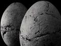
| 11/14/2002 11:40:00 AM | Huevosby RfariasComment: challenge -- met, even though there's nothing there to suggest an actual scale to me, these could be huge. but i am sure they are not. :) technical -- great b&w, focus, and tonal range. composition -- i like the positioning of the eggs and the crop a lot. i would like to see a little bit more room at the top though. -- gr8photos. |
| 11/11/2002 06:20:00 PM | Watching Metal Danceby KrozarComment: love your title! :) challenge -- met. technical -- i would like to see more DOF. you've used it well, but maybe if you'd been more parallel to the metal, you could've gotten some more in focus w/out loosing the diagonal-on view. but, maybe you tried, and didn't like it. this is just my 2cents. i would've also removed the cobwebs first. :) composition -- nice to view this at an angle. did you try cropping just a tad tighter on the left and bottom so that the wall isn't visible below the metal? -- gr8photos. |
| 11/12/2002 01:41:00 PM | Ut Ohhhhby willie55Comment: challenge -- met. technical -- nice focus, and lighting. composition -- not sure why you had your little kid behind the doll, and i can't make up my mind whether i like it or not. sorry i have no decisive opinion on this one ... i'll come back if i make up my mind. -- gr8photos. |
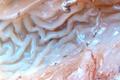
| 11/11/2002 12:21:00 PM | Ignoramus-noncogitansby IndigodingoComment: ugh, sorry, but this looks gross. but maybe that's what you were going for. challenge -- met i guess, even though i see nothing that provides me with a sense of scale. technical -- the picture looks a little fuzzy and you have lots of reflections that are a little distracting. composition -- two things fighting for attention the most are the red veins at the bottom and the shiny thing at the top. overall, i think you are missing an area of focus. -- gr8photos |
|
Showing 641 - 650 of ~1569 |
Home -
Challenges -
Community -
League -
Photos -
Cameras -
Lenses -
Learn -
Help -
Terms of Use -
Privacy -
Top ^
DPChallenge, and website content and design, Copyright © 2001-2026 Challenging Technologies, LLC.
All digital photo copyrights belong to the photographers and may not be used without permission.
Current Server Time: 07/22/2026 07:42:30 AM EDT.
|