|
|
|
Showing 511 - 520 of ~1569 |
| Image |
Comment |
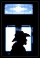
| 01/30/2003 12:22:33 PM | Stetson Silhouetteby GordonComment: not the strongest way of meeting the challenge, but it is met. i think the sillhouette of the guy is the subject rather than the door in the background. your title indicates that, too. but ... i really like your photo. i like how the sillhouette is sharp and distinguishable, and how the glass panels in the door are blurry around the edges. i especially like the blue edge to them. i think this photo would be even more powerful if the window behind the guy didn't have the panel in the middle, and i would also consider cropping out the top panel (at least for outside of this challenge, when this really can become a photo about the sillhouette) and turning this into more of a square photo. the frame you put around it works very well. good work! :) |
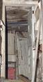
| 01/29/2003 01:05:14 PM | Abandonedby RiderGalComment: challenge met, but not with a totally appealing pic IMHO. a little more contrast would've given the pic more "pop" and i also don't like the harsh shadows (from flash?) but it's hard to say how to change that w/out being there. doesn't exactly look like a place that has electricity. maybe focus more on the door, use a tripod and some portable light if at all possible. |  Photographer found comment helpful. Photographer found comment helpful. |
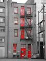
| 01/29/2003 12:59:00 PM | Red 139by JakComment: challenge met. i like how you isolated just the reds in this shot and desaturated everything else. nice repeating patterns. did you consider closing in on them a little more? maybe cropping out everything around the main building and just have that be the photo ... i think i would like that, but that's just me personally :) | | Photographer found comment helpful. |
| 01/29/2003 12:21:15 PM | Sun Drenchedby GraciousComment: challenge met. high-key works here. i love the colorful roof tiles and the blue sky. the composition is ok, too, nothing overwhelming, but then again, i don't know how i would've changed it, either. i do like the inclusing of the trees. | | Photographer found comment helpful. |
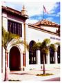
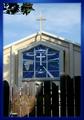
| 01/29/2003 12:19:56 PM | Heaven's Gate?by GeneralEComment: challenge met. nice church building, i love stainglass window. the gates are rather distracting in this shot, even though i understand they are the focus of you shot. the strong light/shadow contrast suggests you took this photo during the daytime, maybe earlier in the morning or later in the afternoon (if that was possible with your schedule) would've softened the shadows some. | | Photographer found comment helpful. |
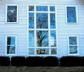
| 01/28/2003 12:08:45 PM | Sudley Church Windowsby 3boyzMomComment: challenge met. i like the tree reflecting in the windows a lot, i was looking around for a shot like that this week but didnt' find anything. a couple of things that i would've considered changing in your photo (and you probably have, and decided they didn't work) is cropping out the foreground in front of the bushes. i don't think it adds to the picture. a little more contrast would've made the photo "pop" more. a difficult thing to control are lines, especially when shooting up a building. they don't look quite straight at the top. centering yourself in front of the middle window (i think you were probably positioned a little to the left) might have reduced the uneven lines, and i would've also tried playing around with a little rotation, even if that makes the windows not quite level, just because the top of the photo is the most noticeable. lastly, you seem to have vignetting on the edges of your photo. is that from a filter maybe? i have that problem, too, sometimes, and try and take pictures a little wider than i need and then crop the picture i actually want out of the center. depending on what was around you that may of course not have been possible. i do like the symmetry of your photo. :) |
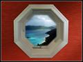
| 01/28/2003 12:01:19 PM | Room With a Viewby AleciaComment: challenge met. i like the textured background, the lighting is pretty even (if not perfect), too. i want to have the kind of view you have there!!! being totally clueless at postprocessing (except for some of the basic steps), i really don't know what to suggest, but the image doesn't quite look real in the window. the only other thing that you might want to consider (and probably already have) is that this is a very symmetrical photo and a square format would've enhanced that even further in my mind. good work overall :)
| | Photographer found comment helpful. |
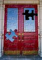
| 01/27/2003 12:45:12 PM | Puzzling Doorby DougPazComment: what a great idea for the challenge! i think you did this with software rather than taking a photo of a jigsaw puzzle, right? like the colors, good photo. personally, i would've cropped just a tad tighter (less of the step at the bottom, maybe even remove it altogether), and a little more off the column on the left, compare the columns at the top of the pic, they are not symmetrical. lastly, the black where the puzzle-piece is missing looks a little uneven around the edges. not sure whether that's the software or something you have filled in manually, so it's difficult to comment what i would change. overall, i really like this shot :) | | Photographer found comment helpful. |
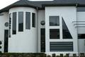
| 01/27/2003 12:41:47 PM | All the Shapesby DennisFComment: challenge met. what an interesting house, i could definitely live there :) i am not sure that i like your crop the best though. the hedge in front compliments the geometric appearance of the house well, i wonder if it had been possible to include more of it (of course i realize that there may have been other things in the way that prevented you from doing it). else, consider excluding it totally. i would have also considered cropping tighter (to the right of the protruding part with the triangle window, some more of the roof so that the sky is not visible in the top middle, and at the left to remove the parial hedge. then increase contrast to make the walls more white. i think you have a shot with lots of potential here, i'm not sure that it's been fully realized though (at least in my opinion). i have an example of my suggested crop if you are interested in seeing it. email me at franziska.lang@lycos.com if you like. | | Photographer found comment helpful. |
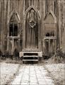
| 01/27/2003 12:30:45 PM | Garden Churchby ShiiizzzamComment: challenge met. nice tonal range in this photo, and duotone is a good choice for this old wooden church. i like all the textures. the symmetry is a good choice, also. the only nitpick i have is that the picture may need rotating just a tad (CCW). i would also considering cropping a bit more off the bottom. leave some of the path, just not as much. just a thought. good entry :) | | Photographer found comment helpful. |
|
Showing 511 - 520 of ~1569 |
Home -
Challenges -
Community -
League -
Photos -
Cameras -
Lenses -
Learn -
Help -
Terms of Use -
Privacy -
Top ^
DPChallenge, and website content and design, Copyright © 2001-2026 Challenging Technologies, LLC.
All digital photo copyrights belong to the photographers and may not be used without permission.
Current Server Time: 07/19/2026 03:38:17 PM EDT.
|