| Image |
Comment |
| 02/10/2003 04:51:38 PM |
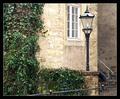
Hide and seek.by kiwinessComment: challenge met. this is one of my favorites so far. the whole composition is just very nice, and the leg about to disappear up the steps fits in nicely w/out distracting from the photo. very well done. :) |
 Photographer found comment helpful. Photographer found comment helpful. |
| 02/10/2003 12:50:06 PM |
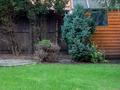
Intruder Alertby auroraComment: challenge met. i like the bright colors of the grass and the shed. they make the photo. i wonder if you could've framed the shot so that those colors dominate the photo more, maybe a vertical crop that still includes the person hiding behind the large shrub. good job on mostly excluding the sky. |
| 02/10/2003 12:48:26 PM |
Virtual Waldo!!!by robconComment: meets the challenge. to be honest, i'm not very inspired by the photo. the background is somewhat drab, and has some of the surroundings intruding (bottom left and top). i wonder if you could've framed this so that these things were excluded. also, and this is just my personal preference, i like to see photos using the maximum width/height to allow the viewer to look at the details more. |
| Photographer found comment helpful. |
| 02/10/2003 10:53:41 AM |
I Spy...by 3boyzMomComment: challenge met. what a great idea! :) i like the little cut-out photo. i also like the mixture of colors and shapes in your pantry, they make the photo just as busy as many of the waldo pictures. the only thing i would suggest is to try and shoot this head on (you have a perspective shot here, too), and crop tighter around the shelves, i would've even tried to crop so that you don't see where they end. |
| Photographer found comment helpful. |
| 02/10/2003 10:49:16 AM |
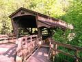
Bridge To My Heartby jerrftComment: challenge met. well, technically, there's only supposed to be one person, and i see two, but i think that's ok. i like how the railings are leading the viewer towards the bridge, and how it is surrounded by all that green. those covered bridges are simply cool. i wish there wasn't quite such a light and shadow contrast (both the shadow on the ground, as well as some of the highlights on the ground and in the trees). maybe earlier or later in the day would've helped. but you might not have been near a bridge at that time ... |
| Photographer found comment helpful. |
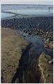
| 02/10/2003 10:35:15 AM |
Big Birdby Ricky CleaveComment: challenge met. nice photo, i love the beach, especially on days where there isn't a person whereever you look. maybe inspired by the perspective challenge, but did you try getting lower to see what the shot looks like from there? might be interesting, too. not sure whether you would still be able to see the person enough, and that's obviously crucial for this week. as for the frame, i think i would've added a 1 pixel black border to define the edges of your photo better before adding the white (which works well btw). |
| Photographer found comment helpful. |
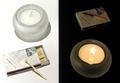
| 02/10/2003 09:13:39 AM |
Day and Nightby elgominComment: i guessed right! :) congrats on that wonderful photo, and the clever setup. |
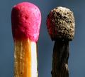
| 02/07/2003 03:29:26 PM |
Mis-matchby Fibre OptixComment: challenge met. good title :) i like how you filled the frame with the subjects, and how there are so many textures to see both in the new and the burnt match. those would work even better if your photo was really really sharp and focused throughout. as it is, there are some softer areas that distract a little. the only other thing is the harsh light from the right blowing out the side of the match. otherwise a good entry :) |
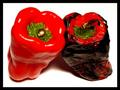
| 02/07/2003 03:27:08 PM |
Roastedby SonifoComment: challenge met. mmmmm ... roasted peppers. yummy! i like how the two peppers seem to support each other and are relatively similar in shape. the colors are nice and bright, yet relatively simple, red, green, black and white. your frame rounds things off well. two suggestions for change: reduce the glare on the peppers by holding a thin sheet of paper between the light source and the peppers. use the full size available (640px in the long side), especially when using a frame. your photo would have more impact when it filled more of the screen. still, i like this a lot. :) Message edited by author 2003-02-10 12:17:53. |
| Photographer found comment helpful. |
| 02/07/2003 03:20:55 PM |
King Flame's Courtby magnetic9999Comment: awesome. i like the smoke leading my eye diagonally through the photo, right to the still burning flame on the match on the left. your colors on the flame and the smoke are very well, the unburned part of the matches is a little darker than i would like, but since they don't play a big role in this, that doesn't really matter too much. the frame works very well here, too, both in color and composition. i probably would've made the blue/purple line a pixel thinner and the black part a pixel wider, but that's purely personal taste. what you have is fine. |
| Photographer found comment helpful. |
Home -
Challenges -
Community -
League -
Photos -
Cameras -
Lenses -
Learn -
Help -
Terms of Use -
Privacy -
Top ^
DPChallenge, and website content and design, Copyright © 2001-2026 Challenging Technologies, LLC.
All digital photo copyrights belong to the photographers and may not be used without permission.
Current Server Time: 07/19/2026 03:45:25 AM EDT.