|
|
|
Showing 421 - 430 of ~1569 |
| Image |
Comment |
| 02/24/2003 03:22:56 PM | Stock Photo Frame Insertby crabappl3Comment: Challenge met, I could almost see this as a frame insert. B&w is often used for those, and it works well here. You've achieved a nice tonal range, although just a tad more contrast would've been nice, too. Two things to consider are (a) the pillow ... I think a more simple pattern or even a single color would've been nice and (b) have the girl smile and raise her head a little bit. I shouldn't give you advice, I don't even attempt portrait photography (my one attempt in the b&w portrait challenge was my worst score ever), but I'm telling you that, from a viewer's point of view, these things would improve the photo. She is a cutie, btw. :) Also, I wonder if you are getting comments about the shadow/light stripes on her hair ... personally, I think they add to the photo. |  Photographer found comment helpful. Photographer found comment helpful. |
| 02/24/2003 03:18:12 PM | Baby's First Stepsby inspzilComment: Challenge met. Very cute shot, they grow up too fast. I like how the kitten is stretched out and still not very long., The background goes with it nicely, the shadow from the tail is something that I'd expect you to tone down for real stock photography, but of course spot-editing isn't legal for DPC. :) | | Photographer found comment helpful. |
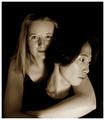
| 02/21/2003 09:22:05 AM | Love has No Boundariesby NatashaComment: Natasha, sorry I didn't get around to voting and commenting on this one ... it's an absolutely beautiful portrait of you and your husband. I also like the story behind it ... probably because I'm from Germany and my husband is from the US :) | | Photographer found comment helpful. |
| 02/20/2003 05:09:10 PM | Happy Valentine's Dayby SonifoComment: Challenge met. Two cute hearts, I like how they are leaning towards each other. The strong lighting, creating those red shadows works very well here, especially since you didn't get glaring hotspots on the hearts, just nice little highlights (I bet that was tough!). I don't usually like pink and red, but they go together well here. A black border works well, too, I would probably remove the white altogether (nothing in your photo is white, so that part doesn't tie in well) or replace it with a thin red border to match the hearts. Nice photo. :) | | Photographer found comment helpful. |
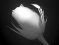
| 02/20/2003 05:07:27 PM | This one for you!by rj324Comment: Challenge met, I guess, although I've seen stronger associations ... w/out the title I wouldn't necessarily think of love. I like unusual flower shots and b&w is unusual, so points for creativity. I like that some of the texture of the rose petals is visible. The stem and leaves look very pale, I would expect them to be darker but maybe you just used a dark rose. That does give this photo a little unreal feeling though. Your lighting is uneven, even if there aren't any glaring hotspots. I'd love to see a little more on the bottom of the rose and the stem, too. | | Photographer found comment helpful. |
| 02/20/2003 03:22:16 PM | Entwinedby lisaeComment: Hi Lisa! :) (at least I'm pretty sure this is you). Great photo. I like the composition and crop very much, the way her lips are pressed against his hand which in turn is larger and curved around her hand. I personally would like to see this in b&w rather than toned and with a little less grain, but I have a feeling you did this deliberately, it's more your style. Regardless, I like this one a lot. | | Photographer found comment helpful. |
| 02/20/2003 03:18:16 PM | Snugglin'by JackoComment: Challenge definitely met. My initial reaction was that the feet aren't quite sharp because they are moving and not relaxed, but the more I look at this the more I like it. Format is great, and the toning is, too. Overall, it's just a bit grainy, but a good entry regardless. | | Photographer found comment helpful. |
| 02/20/2003 03:16:47 PM | Drawne for Loveby IceRockComment: Hm. Without the title, love is not something I would've thought of looking at your photo. As a photo, I find it quite interesting, you can see all sorts of things in the lighter reflection. The white hotspot is a little too bright though, especially since the whole rest of the photo is very muted. Two more things, personally, I don't like that light blue drop-shadow, especially since it doesn't match anything that you have in your photo, and I feel the border should pick up on something in the photo, and I would like to see you using the whole 640px that are allowed for the longer side, your photo seems a bit small. |
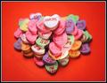
| 02/20/2003 02:44:42 PM | Love -- Mah Jongg Styleby karmatComment: Challenge met. Great use of the candy hearts! I think you arranged them in a heartshaped format, but that's not easily visible. Instead, it looks like the pile of hearts is a little uneven. Did you try a more traditional arrangement? As for the technical quality, it is good, I like tha the ones at the bottom aren't quite in focus, adds to the feeling of depth. The red background and the border works well here. | | Photographer found comment helpful. |
| 02/20/2003 12:51:30 PM | Happy Hallmark...er...St. Valentine's Dayby zadoreComment: Challenge met. I like how you saturated everything but red and then repeated the red in the border. Works well. The flowers look a little sad, maybe that's because they are dried (?) or just because they are lying down. The teddy with the heart and bow-tie and red nose is just too cute. A little reflected ligthing from the left would've helped lighten up the dark shadows. Overall a good entry :) | | Photographer found comment helpful. |
|
Showing 421 - 430 of ~1569 |
Home -
Challenges -
Community -
League -
Photos -
Cameras -
Lenses -
Learn -
Help -
Terms of Use -
Privacy -
Top ^
DPChallenge, and website content and design, Copyright © 2001-2026 Challenging Technologies, LLC.
All digital photo copyrights belong to the photographers and may not be used without permission.
Current Server Time: 07/19/2026 03:37:36 PM EDT.
|