|
|
|
Showing 361 - 370 of ~1569 |
| Image |
Comment |
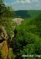
| 05/15/2003 04:39:06 PM | Hawksbill Crag Upper Buffalo National River Wilderness Areaby kandyjComment: A Comment From The Critique Club
Hi Kandice,
my first impression was - WOW - that's quite some scenery there. Definitely postcard material!
COMPOSITION / CONTENT - Composition is fine. Your husband is positioned so that the viewer can easily take in the scenery but won't miss him (and you wouldn't get the sense of scale if he wasn't there). If you hadn't said you didn't know about the challenge I would've suspected that you planned for him to wear an orange shirt! It fits in perfectly, makes him stand out without standing out too much. For a postcard, I think I would've preferred him looking over the land rather than right at the camera but that's a minor quibble. It's a shame there was a big cloud over the woods in the back but of course you didn't have control over the weather ...
CAMERA WORK / TECHNICAL - I think you did pretty well here. Everything's nicely in focus as it needs to be for a scenic postcard such as this one.
POST-PROCESSING - The lush shades of green are very nice, I'd like the sky to be a little more saturated and blue (as they are often a little oversaturated in postcards), but overall I like the colors. The text is sized about right and I like the font, I just would've moved the text a little more to the left, right now it feels too close to the edge of the picture.
I like your entry to the challenge a lot, and so did most of the voters judging by the score you got. A well-deserved high placing. I just read through the comments, and it seems that many people agree with me on the sky and I'm in the minority on the text ... I do like the suggestion to add the state to the text to make it even more postcard like. Good work, keep it up :)
Please let me know if you have any questions or comments about this review.
Franziska. |
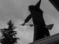
| 05/14/2003 05:24:36 PM | Witch - Craftby BeetleComment: A Comment From The Critique Club
Hi Karin,
I'm sorry my CC review is a bit late, I requested your photo and then lots of stuff happened at work ... but I'm now getting to it. :) My first impression was how unique yet obviously recognizable your approach to the challenge was, I would've never thought of broomstick-riding :) Definitely meets the challenge.
COMPOSITION / CONTENT - Looking up at the witch and just seeing the profile works really well here, so does the cloudy sky. I don't like the corner of the roof in the top right but I guess that was probably unavoidable, I would also like to have seen the whole hat in the picture, since only the very top is cropped off it looks a bit accidental to me. The tree is great in the picture, gives me even more context.
CAMERA WORK / TECHNICAL - Conversion to black&white was definitely the right decision here, and not just because it removed emphasis from the overcast sky. I kind of always see the image of the witch flying on the broom over forests, right in front of the moon, so I always imagine them in silhouette anyhow. Focus is good, usually I'd say the pic is a little underexposed, but that's probably deliberate because it works here.
MY OPINION - A creative approach to the challenge, changing the angle of your photo (still up, but excluding more of the roof) would've probably improved your score, as well as increasing the brightness (even though I kind of like it that dark, it fits the mood). Glad your daughter didn't fall off and had fun helping you with the challenge :)
Please let me know if you have any questions or comments about this review.
Franziska. |  Photographer found comment helpful. Photographer found comment helpful. |
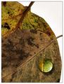
| 05/13/2003 10:33:38 AM | Dropby jjbeguinComment: Great texture, and that drop adds just that little bit extra interest. Did you shoot this on a lightbox? | | Photographer found comment helpful. |
| 05/12/2003 09:35:27 AM | Pick Your Colorby RefocusedComment: Ooops, my mistake. Smarties is what M&Ms are called in Germany. :) As for the mirror, if you read the comment Lawrence posted on his picture, he describes using a mirror ...
Originally posted by Antithesis:
franziska, these are M&Ms. What is a smarty? As for the mirror thing, I can't see anything here that suggests that a mirror was involved, and Inede doesn't explain. The focus problem is throughout. I think it is a good idea and well set up, but let's get to the bottom of the photography part of it, please. |
| | Photographer found comment helpful. |
| 05/11/2003 11:40:22 AM | Softly Softlyby FranziskaLangComment: David, absolutely, go for it :) It's a nice compliment when someone wants to copy your stuff! The original image here was pretty harshly lit, so I desaturated all but yellow and then added a fog and sunbleached filter. Then selected the area for the frame, inverted selection, further desaturated outside and blurred a little bit, then selected inside again and applied the filter for the frame.
Click here to see the original file (only resized and USM applied). Message edited by author 2003-05-11 11:43:59. |
| 05/11/2003 11:33:04 AM | Mmm . . . Tomatoesby FranziskaLangComment: Thanks, guys. That was taken at a snake exhibit (but they obviously had more than snakes :) in Germany last week. |
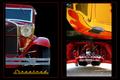
| 05/07/2003 12:26:30 PM | Streetrodby crabappl3Comment: A Comment From The Critique Club
Hi Danny!
Remember me? I'm your personal CCClub commenter ;) I like that role, too, because, as always, your image is very well done :)
The red and yellow colors of the images are beautiful and nicely contrasted by the black background. I like that the left image instantly gives you a context for the two images on the right and that you have to look at them a little closer to figure out the angle that they were taken at. This way, you combine to get the instant impact that seems to be necessary to score well on DPC as well as the "hold the interest" aspect that is necessary for people to like images beyond the first impression.
The images themselves are very nice, not too many reflections, sharp, good contrast. The image on the left could be a tad lighter and (even though it is not), looks slightly tilted because of the curve of the roof I think.
Overall, I think the multi-image composition feels a little unbalanced to me. The left image is a lot cleaner and less "cluttered" (strong word, I can't think of a better one just now), while the two images on the right both have a lot going on and, on the very first glance, seem to be one image. Maybe separating them through a red border, too, would've helped that, or even just allowing a little more breathing space between the images.
I like the text and the title, the color goes well with the images and the font is just perfect for the old cars, and nicely repeats what is visible in the left image already.
In summary, your entry definitely meet the challenge, the photos tell a great story about beautiful old cars and I think many an old car fan could imagine this on their wall at home. Good work as usual, with only small areas of possible improvements.
Please let me know if you have any questions or comments about this review.
Until my next review of one of your entries, take care ... :)
Franziska. | | Photographer found comment helpful. |
| 05/06/2003 09:09:59 AM | Breaking Free by FranziskaLangComment: Well, what better thing to come back to from vacation than a ribbon? Thank you all so much for your kind comments and votes :) |
| 04/28/2003 12:53:20 PM | |
| 04/28/2003 12:42:59 PM | | | Photographer found comment helpful. |
|
Showing 361 - 370 of ~1569 |
Home -
Challenges -
Community -
League -
Photos -
Cameras -
Lenses -
Learn -
Help -
Terms of Use -
Privacy -
Top ^
DPChallenge, and website content and design, Copyright © 2001-2026 Challenging Technologies, LLC.
All digital photo copyrights belong to the photographers and may not be used without permission.
Current Server Time: 07/19/2026 03:45:36 AM EDT.
|