| Image |
Comment |
| 06/17/2003 11:07:23 AM |
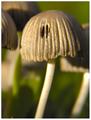
Mushroom Newsby LarsPaysenComment: LOL ... I can't believe there's actually a magazine just about mushrooms but I found it on the net. Your photo fits it well and is also a good photo in itself. Nice DOF and composition, just some blown out areas on the stems ... maybe take a gauze scarf or something with you onto your photo endeavors and then hold that between the subject and the sun to soften the light. Still high marks from me. (7) |
 Photographer found comment helpful. Photographer found comment helpful. |
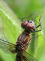
| 06/17/2003 11:07:12 AM |
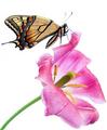
American Entomologist by connieComment: Very beautiful. Love the focus and the colors and the fact you captured this in a single photo and for the challenge. Now, this is going to sound strange coming from me, knowing my love for the perfect white background (which you've defintely achieved here, but it looks unnatural. I would fully expect some blurred green vegetation in the background. Plus, the angle of the flower and the butterfly on it looks a little strange, too. Regardless, focus and lighting is exquisite. (7) |
| 06/17/2003 11:06:52 AM |
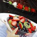
Family Circleby KarenBComment: Wonderful color, great choice of DOF. Not sure about the funky angle but I think it might just work. The starfish and piece of wood seem very out of place for me, and a tablecloth that covers the whole table would've just perfected the scene. Still a pretty good shot. (6) |
| Photographer found comment helpful. |
| 06/17/2003 11:06:37 AM |
Action Asia: Lakeside viewsby starblazerComment: I just checked out Action Asia on the web and the format and topic you have chosen seems to fit the magazine well, so you definitely met the challenge. They do generally seem to have some more obvious (larger) main focus in their pictures, though. (6)
Anyhow, as a photo, I like this a lot, the birds add a very nice touch and the layers of the land behind the lake are nice, too. Clouds are always a plus for sunset shots, especially if they at least partially hide the sun and therefore avoiding the blown out effect a bit. Nice entry :) |
| Photographer found comment helpful. |
| 06/17/2003 11:06:21 AM |
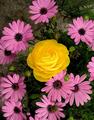
Better Gardensby pitsamanComment: Wonderful flowers, but the rose looks totally out of place. I suspect that\'s just what you wanted to achieve, but it still looks very strange to me. But, your focus and lighting is very good. I generally like the \"odd one out\" idea, maybe if you had placed the rose not in the center of the image ... dunno. (5) |
| Photographer found comment helpful. |
| 06/17/2003 11:06:10 AM |
BabyTalkby jdavisComment: This one makes me smile every time I see it. Definitely could see it on the magazine cover, but probably with the background edited out. Just wish your submission was a little larger (I'm sure you've already heard that one once or twice) so I can see if it is in focus and enjoy the details of your baby's face. As it is, I get the feel it's just a little out of focus. Still, a precious expression, plus great catchlights in the eyes. (5) |
| Photographer found comment helpful. |
| 06/17/2003 11:05:52 AM |
New Jersey Monthlyby mattsComment: I just checked out NJMonthly on the web and it seems they use quite a variety of cover photo formats so I'll accept this one ... even though it doesn't strike me as very typical, or easily cropped into a vertical format. But there's room at the top to put text, that's a bonus. (4)
Anyhow, as a photo, I like how you've filled the space with the boat. The little parachute is a nice addition. I can see this kind of pic being used to lure people to NJ. Overall, your image appears quite soft though, and that's something I wouldn't expect to see on a magazine cover. Not sure if that's focus or might be easily fixed with a little USM. |
| Photographer found comment helpful. |
| 06/17/2003 11:05:17 AM |
Moja Beba (eng. My Baby Magazine): Sweet Little Angel's Dreamby gaja_tzComment: Don't they look peaceful when they sleep? While the subject certainly fits the magazine, I can't really see this on a magazine cover, sorry. The angle would make people try and turn the magazine on its head to see the pic the "right" way up (even though I'm pretty sure this is the way you took the photo), and it's overall a little dark and soft. It does allow for text to be added though which is also important. (3) |
| Photographer found comment helpful. |
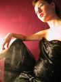
| 06/17/2003 11:04:59 AM |
Fashionby TonesOfGrayComment: The composition looks a little off (don't like her head to the side like that to fit in the frame), but it does allow room for text which is good. Is this shot through a window? There seems to be a reflection in the lower left quadrant. The lighting is also a little harsh and uneven (blown out highlights on the neck and leg). (2) |
| 06/17/2003 11:04:44 AM |
National Wildlifeby amandolinComment: The composition and subject are great for a "National Wildlife" magazine, enough interest, yet still room for text to be added, and in a format that typically reflects magazines. However, as both a magazine cover and a photo, you are really being let down by the lack of focus and sharpness. This needs to be really crisp for this kind of photo to work ... did you maybe get closer than your camera could properly focus (I know I do that way too often). I do like the crop. (2) |
| Photographer found comment helpful. |
Home -
Challenges -
Community -
League -
Photos -
Cameras -
Lenses -
Learn -
Help -
Terms of Use -
Privacy -
Top ^
DPChallenge, and website content and design, Copyright © 2001-2026 Challenging Technologies, LLC.
All digital photo copyrights belong to the photographers and may not be used without permission.
Current Server Time: 07/18/2026 09:27:07 AM EDT.