|
|
|
Showing 1301 - 1310 of ~1569 |
| Image |
Comment |
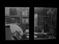
| 06/05/2002 12:42:00 PM | Looking in the Shed at Nightby HoltwComment: You need to clean up that shed! ;-) Even though there's nothing really white or black inside the shed, the contrast is pretty good. The glare from the light on the windows add to this shot. What is the actual focus, my eye keeps wandering but not really staying anywhere. |
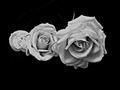
| 06/04/2002 08:36:00 AM | Stunning In Any Colorby cthenkComment: I'm sure you'll get "but why would you take a b&w shot of a flower" kind of comments (I am for my flower shot). I think if there's contrast and texture in the shot, b&w can work well, your photo is an example of that. I would probably not place the roses in the middle of the shot though, I'd prefer to see them in the bottom right hand side for example. Also, the rose on the left seems slightly blown out - would it have been possible to adjust the lighting for that a little? |
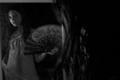
| 06/03/2002 11:10:00 AM | Mysteryby GrayerSkiesComment: Unfortunately, this shot is a little too mysterious for my liking. Just a little lighter or a little more focus would've helped. Also, if you could've cropped out the light gray bar over the girl's head. |
| 06/03/2002 11:13:00 AM | cave in to the darksideby heartsdivideComment: Did you rotate the photo so we could read the guy's shirt better or for some other reason I don't get? Also, the bright light in the lower left corner is distracting. |
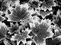
| 06/03/2002 11:47:00 AM | These are Geranium Leaves?by roshelly35Comment: Nice contrast. Leaves in front don't seem to be quite as much in focus as some of the ones in the back. Needs a center. A bug on a leaf or something like that would hold the interest a little longer for me. |
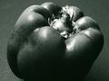
| 06/04/2002 01:23:00 PM | Westonisedby GordonComment: Not a bad shot, but unfortunately, a better one was submitted. Light background would've given more contrast and polishing/drying the pepper would've helped, too, IMO. I like how close you moved in |
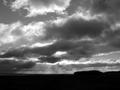
| 06/03/2002 11:07:00 AM | stormy weatherby snowComment: I like it when the sun rays shine through the clouds that way. Having said that, I think that works better in color. There's not enough here to hold my interest, unfortunately. |
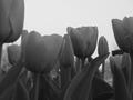
| 06/03/2002 12:41:00 PM | Up closeby sweetk1685Comment: IMO, there's not enough contrast in here (sky vs. flowers, yes, but the flowers are just similar shades of gray). I do like the composition (cropped flowers at the sides to frame). I think the whole tulip on the left should be the one in focus. |
| 05/28/2002 08:55:00 AM | Is This Right?by Dangerous_bluesComment: LOL, was the hair color so bad that you had to switch to b&w??? Very great humor shot. I like the composition, and the angle. Just wish her face was a little lighter. |
| 05/29/2002 09:34:00 AM | Snuckby JohnnyBoyComment: Hehehe, this is how I like to take people shots, too, when they don't know... ;) Interesting composition. I think this shot would've benefited from the alternate cropping (cropping some off the left side to make it 640x480) so that there's less gray in the picture. Also, if you could've snuck this shot while the guy was looking up so his eyes were visible - now that would've been cool. |
|
Showing 1301 - 1310 of ~1569 |
Home -
Challenges -
Community -
League -
Photos -
Cameras -
Lenses -
Learn -
Help -
Terms of Use -
Privacy -
Top ^
DPChallenge, and website content and design, Copyright © 2001-2026 Challenging Technologies, LLC.
All digital photo copyrights belong to the photographers and may not be used without permission.
Current Server Time: 07/18/2026 03:41:36 AM EDT.
|