|
|
|
Showing 1071 - 1080 of ~1569 |
| Image |
Comment |
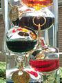
| 07/03/2002 04:41:00 PM | Whats the temperature?by wargloryComment: i love the idea. things that i would've considered doing differently during the execution are: a neutral background, making sure your horizon is level. just a tad less direct light so that the top is not quite as bright. -- gr8photos (5) |
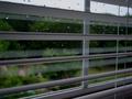
| 07/03/2002 02:14:00 PM | Rainy Dayby BambooChicaComment: IMO, while meeting the challenge, this would have been a little more interesting if you could've focused or zoomed in more closely on the water drops to show off the distortion there a litlte more. -- gr8photos (4) |
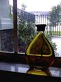
| 07/01/2002 04:05:00 PM | oil gardenby anitraComment: your photo is very pixelated. i'm not sure whether that was an intent and you saved your file that small for that purpose, or not. if not, there are some tutorials on this site that help you save the files so that your photos aren't so pixelated. you've met the challenge for sure (color and distortion), but the photo unfortunately doesn't hold my interest for very long. i'm also not quite sure what you should've done about it. was there maybe a way of placing the oil in the kitchen (while still having light falling through it, could be artificial light) to tie it in with the background a little more? i guess oil and garden don't connect for me. -- gr8photos (3) |
| 07/08/2002 12:01:00 AM | |
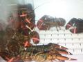
| 07/01/2002 03:31:00 PM | death rowby queen 91Comment: ouch. true title. i know how difficult aquarium shots are, this one is pretty good for that. i'm assuming that you couldn't get the whole lobster (or whatever crustation i'm looking at here) in the shot in the foreground. you met the challenge, although i would've liked to have seen more along the lines of distortion and/or color, but i realize that's my interpretation of the challenge. (gr8photos - 4) |
| 07/02/2002 09:43:00 AM | Happy Hourby DiamondgirlComment: while i like the idea, i'd like to see something more in focus in this shot. also, the tripod doesn't quite fit the scene (although, mine is always standing around in the house like that, so i totally understand), and the street lights are a little too bright IMO. -- gr8photos (4) |
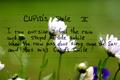
| 07/03/2002 04:46:00 PM | Cupid's Smileby arnitComment: interesting! i had to look at this for a while to figure out what you had done. i think it's simply writing on a sheet of glass, there are some reflections of the flower visible. why the lines? that's the part i don't get. also, keep an eye out for things that just protrude into your frame, they can become a little distracting. there's a white flower poking in from the right, and the tip of a leaf at the bottom, just left of the middle. try and eliminate those. -- gr8photos (5) |
| 07/07/2002 10:56:00 AM | Squint!by GordonComment: great idea. fits the challenge perfectly. and the title works, too. --gr8photos (7) |
| 07/01/2002 03:45:00 PM | Gerbera jamesoniiby superdneComment: your photo is very pixelated. i'm not sure whether that was an intent and you saved your file at half allowable size for that purpose, or not. if not, there are some tutorials on this site that help you save the files so that your photos aren't so pixelated. i'm also wondering why you went with b&w for this shot. as for the challenge, yes, you met it, there's transparency and some distortion. i guess more overall clarity and contrast (or even color) would've improved this shot for me. -- gr8photos (3) |
| 07/08/2002 10:05:00 AM | Studyby drealmerComment: sorry, i ran out of time to comment. i was going to say that i really like the blue pens against the b&w of the rest of the photo. how did you do that? |
|
Showing 1071 - 1080 of ~1569 |
Home -
Challenges -
Community -
League -
Photos -
Cameras -
Lenses -
Learn -
Help -
Terms of Use -
Privacy -
Top ^
DPChallenge, and website content and design, Copyright © 2001-2026 Challenging Technologies, LLC.
All digital photo copyrights belong to the photographers and may not be used without permission.
Current Server Time: 07/19/2026 01:07:54 PM EDT.
|