| Image |
Comment |
| 11/19/2003 09:49:38 PM |
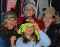
Fun in the Dressingroomby RxP13Comment: This seems more like a snapshot capturing a fun memory for the participants than a photograph trying to spread an idea to strangers. They are certainly having fun, but I'm sorry to say it doesn't have much meaning for me. |
| 11/19/2003 08:14:04 PM |
root of all evils...by imagesloyolaComment: At first glance, I'm reminded of the biblical allusion to money as the root of evil, but suddenly I notice how it's rolled to draw attention to the faces on the bills, so now think it's saying that politicians that are the root of all evils. Nice job. |
| 11/19/2003 08:07:26 PM |
|
 Photographer found comment helpful. Photographer found comment helpful. |
| 11/19/2003 07:58:13 PM |
|
| Photographer found comment helpful. |
| 11/19/2003 07:56:33 PM |
Eat at Tony's, it's the best.by bruskiComment: Advertising is a form of propoganda, and this looks delicious. Nice array of textures, although a bit soft; some sharpening would help them stand out more. Something green (a salad?) would have made a nice allusion to the Italian flag, but there is certainly plenty there without it. |
| Photographer found comment helpful. |
| 11/19/2003 07:41:50 PM |
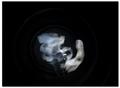
Voyage Of Spiritsby amateurboiComment: I'm not sure what idea this photo is trying to convey. But the image does catch the eye and the "spirit" has an interesting shape and texture (although there are some apparent specular highlights that are distracting). |
| Photographer found comment helpful. |
| 11/19/2003 07:37:05 PM |
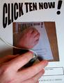
CLICK TEN NOW!by PaulkComment: 10? OK... Oops... Missed... Got the 1 instead... ;-)
Seriously, this photo clearly conveys your message, which is extra important for this challenge. Artistically, I wish you had done one more level so the bottom paper wouldn't be just white under the hand. |
| Photographer found comment helpful. |
| 11/17/2003 11:56:34 PM |
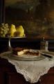
Back from a walk in the woodsby sergutComment: Greetings from the Critique Club!
I really like this image. It has an inviting, warm, peaceful feeling. Your comment implies you wanted to portray coziness and you were successful. You've chosen quite a few compatible yet contrasting elements and arranged them very nicely, with multiple levels to add interest and realism. Good lighting, focus, and processing. The mildly low key tonality works very well.
Although a great photo, since you requested a critique I feel obligated to point out the few flaws. It seems tilted slightly clockwise (or perhaps the painting is just not straight; it has a lot of horizontal and vertical lines that aren't quite). There is some glare from the light on the right side of the painting. The linen has some distracting folds (a bit too realistic!). |
| Photographer found comment helpful. |
| 11/17/2003 11:02:56 PM |
Blue Coolby GraciousComment: Critique Club comment:
A striking image from a few simple elements nicely arranged with dramatic lighting. The black background creates a stark contrast that really grabs the viewer's attention. Although made of the same material, the Slinky and jacks have entirely different textures, providing some contrast, and there is a nice gradation of texture from the left to the right side of the Slinky. A couple of minor flaws: a bit cramped at the top and too much glare on the rightmost jack. But overall a nice image. |
| 11/16/2003 11:51:48 PM |
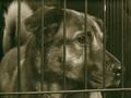
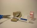
Attacked from all sides!!by sknittel646Comment: Per your request from the Critique Club:
This is a humorous photo; it's easy to see that the pen is being attacked. For what it's worth, I wouldn't have even imagined a correlation to struggles in our own lives; even with your comment I have a hard time making the connection because of the whimsical nature of the photo. But that doesn't stop the photo from conveying a clear message, even if not the one you intended.
Unfortunately, the photo doesn't have much impact. It's elements don't contrast with each other enough. A black stapler with a textured finish and a harsher light to cast stronger, more distinct shadows would have been better. And here's a crazy idea: replace the background with a classic draped cloth like those used in traditional still lifes. I'm frankly not sure how that would affect the message, but it might be fun to try. |
| Photographer found comment helpful. |
Home -
Challenges -
Community -
League -
Photos -
Cameras -
Lenses -
Learn -
Help -
Terms of Use -
Privacy -
Top ^
DPChallenge, and website content and design, Copyright © 2001-2026 Challenging Technologies, LLC.
All digital photo copyrights belong to the photographers and may not be used without permission.
Current Server Time: 07/21/2026 12:59:25 AM EDT.