| Image |
Comment |
| 01/02/2004 10:32:18 AM |
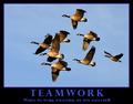
Teamworkby dan_pendletonComment: Great photo! Good composition, lighting, and focus. The overall poster layout is also well done. But the birds don't really seem to be working together; they are just traveling together to the same place. |
 Photographer found comment helpful. Photographer found comment helpful. |
| 01/02/2004 10:15:47 AM |
Innocenceby wkmenComment: My first impression was great; the photo grabbed my attention and the message came through. But it isn't something I enjoy looking at for long. I guess it might be a good poster for the back of a bus, but not an office wall. |
| Photographer found comment helpful. |
| 12/30/2003 12:01:15 PM |
Circus! CIRCUS!by sergutComment: Greetings from the Critique Club!
The message I get from this photo is the unique art this company has on the side of its truck. The image was made under perfect lighting conditions: the three-dimensional nature of the art is apparent but the shadows aren't long or harsh. The focus is perfect, though a bit soft; I think some sharpening would make the photo a bit more snappy. Including the wheel and cobblestones provides the setting needed to understand what the image is about. I don't think the framing is quite right. There are distracting elements on the left and right sides that don't really add anything and could be cropped off. The arcs across the top are cut off, but it would have been nice to include them. If stepping back a foot when the exposure was made wasn't an option, a thin (2-3 pixel) black border would at least prevent them from "bleeding" out of the image. |
| Photographer found comment helpful. |
| 12/29/2003 08:43:46 PM |
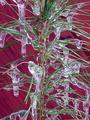
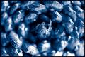
Red and Green Macroby amsmythComment: Greetings from the Critique Club!
This is an attractive photo that conveys something of the holiday season with the evergreen twig, ice, and red background. There are some interesting shapes and textures that are pleasing to look at. The focus is a bit soft, which adds to the festive feeling. What it lacks is something to catch the viewer's attention; a center of interest to draw the viewer into the image. This dooms it to mediocrity. It would work well as an element of something larger, such as a printed program for a Christmas concert. But as a stand-alone work a typical person would glance at it, think "pretty", and move on. |
| 12/29/2003 10:23:20 AM |
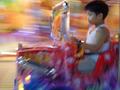
Choo-Choo-Trainby litosantiagoComment: Greetings from the Critique Club!
This is a very colorful and dynamic photo. The motion blur in the background, caused by panning, is conventional and conveys a sense of motion. It is nice that the bright lines stop short of the boy's face. The motion blur on the vehicle appears to be caused largely by the perspective change as it moves closer to the camera, and is certainly not typical of panned photos. The overall shape is still apparent yet the blur gives a nice abstract feeling; I think it is effective. The boy's face is surprisingly clear compared to the rest of the picture, but is still blurry. Too clear to make the entire image an abstract, but too blurred (and too close to the edge) to be the center of attention, it keeps the photo from coming together and expressing an interesting message. |
| 12/28/2003 06:00:30 PM |
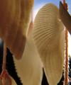
hanging shellsby dasserComment: The backlit string at the right attracts too much attention, even though it is near the edge and out of focus. Removing it and increasing the depth of field so the entire shell is in focus rather than just the top part would make this photo a lot more interesting. |
| 12/28/2003 05:56:23 PM |
Nature's Treasureby moodvilleComment: The center and corners being the only things in focus gives this a rather funky appearance. Maybe it would work if there was some space around the in-focus bracts at top and bottom, but I don't find it very interesting as it is. |
| Photographer found comment helpful. |
| 12/28/2003 05:46:56 PM |
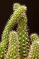
Sticky Situationby TerryGeeComment: Interesting shapes and nice contrasting background. Depth of field is a bit narrow; it would be better if the main stems were better focused (although the out of focus foreground works great). And a closer shot would have been more appropriate for a Macro challenge. |
| 12/28/2003 05:38:59 PM |
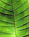
poinssetias leafby PepetteComment: The harsh lighting makes the venation really stand out, but to me the strong contrast it creates isn't consistent with the character of the leaf. |
| Photographer found comment helpful. |
| 12/27/2003 11:58:37 PM |
|
| Photographer found comment helpful. |
Home -
Challenges -
Community -
League -
Photos -
Cameras -
Lenses -
Learn -
Help -
Terms of Use -
Privacy -
Top ^
DPChallenge, and website content and design, Copyright © 2001-2026 Challenging Technologies, LLC.
All digital photo copyrights belong to the photographers and may not be used without permission.
Current Server Time: 07/18/2026 07:52:36 AM EDT.