| Image |
Comment |
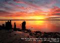
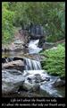
| 01/02/2004 12:44:54 PM |
Inspirationby mbardeenComment: Beautiful colors, nice composition, appropriate quote. The foreground seems a bit dark, especially on the left. The letters are slightly blurry. |
 Photographer found comment helpful. Photographer found comment helpful. |
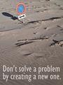
| 01/02/2004 12:38:38 PM |
Think Twiceby jjbeguinComment: Interesting textures and shapes. The sign is a bit close to the top, but is still the obvious center of interest. I'm not sure what it means, so don't really understand the allusion to creating a new problem. The sharpness is great except for the sign's shadow, which has a halo I'm guessing is from oversharpening; since spot editing was allowed for this challenge it would have been nice to avoid that. |
| Photographer found comment helpful. |
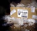
| 01/02/2004 12:27:27 PM |
Ideas without action are worthlessby dasserComment: The photo is set up well and humorous. Good lighting, focus, and exposure. The message it gives me is "Beware of bad ideas!" rather than what the title says. |
| Photographer found comment helpful. |
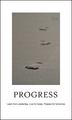
| 01/02/2004 12:18:21 PM |
Progressby ronnersComment: Effective use of a narrow depth of field. Good composition on the photo, but I wish it was a little bigger in relation to the poster. A thin border around the photo might help as well. |
| 01/02/2004 12:09:18 PM |
|
| Photographer found comment helpful. |
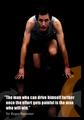
| 01/02/2004 11:47:13 AM |
Drive yourself furher..by jonpinkComment: Good pose and expression, and the low key approach works well with the poster's theme. I don't know that the runner is in pain yet, but the idea comes across anyway. The orange arrow adds a nice touch of color, but the way it crosses the model's hand and wrist is rather distracting. |
| 01/02/2004 11:17:15 AM |
Key to successby drydocComment: Simple but effective composition. Well chosen elements and good lighting. The font used for "Success" doesn't work well with the font used for the rest of the text. |
| Photographer found comment helpful. |
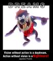
| 01/02/2004 11:09:57 AM |
Dreamsby wwjdwithcaComment: The photo does seem nightmarish, although unnecessarily washed out. It would be a bit zany by itself, but works in the context of the poster. Splitting the word "DREAMS" was a good idea, but white lines on a black background look thicker than the opposite, so top and bottom don't really match. |
| Photographer found comment helpful. |
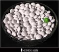
| 01/02/2004 11:01:08 AM |
Individualityby rickhd13Comment: Creative! The lighting works surprisingly well; generally double shadows should be avoided, but here it adds to the overall confusion and anonymity of the white candies. The overall poster seems a bit crowded; either remove the white border or put space around it. The aliasing in the font may be part of its individuality, but I find it distracting. |
| Photographer found comment helpful. |
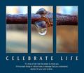
| 01/02/2004 10:51:35 AM |
Celebrate life by timmiComment: Beautiful overall, and interesting (and surprising) when you look closely. The fake triptych format works very well. |
| Photographer found comment helpful. |
Home -
Challenges -
Community -
League -
Photos -
Cameras -
Lenses -
Learn -
Help -
Terms of Use -
Privacy -
Top ^
DPChallenge, and website content and design, Copyright © 2001-2026 Challenging Technologies, LLC.
All digital photo copyrights belong to the photographers and may not be used without permission.
Current Server Time: 07/18/2026 07:49:42 AM EDT.