|
|
|
Showing 371 - 380 of ~1171 |
| Image |
Comment |
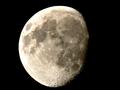
| 06/12/2004 10:29:24 AM | A DOF of how many kilometers? What the?by ionyouComment: Ahhh, you've discovered the secret to deep DOF: use a long telephoto and shoot something far away! I'd have been really impressed if you could have arranged to include a perfectly focused bird flying across...
Although overexposed on the edges, this image nicely shows both the interesting craters at the terminator and the beautiful ray systems of several prominent craters, especially Copernicus. |
| 06/12/2004 10:11:01 AM | |  Photographer found comment helpful. Photographer found comment helpful. |
| 06/12/2004 10:00:58 AM | Stormy Manhattanby admart01Comment: The clouds make a great backdrop for the building, which is nicely proportioned. The subject is slightly underexposed, giving it a pleasing low-key appearance consistent with the overall mood of the image. Great job. | | Photographer found comment helpful. |
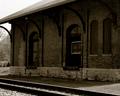
| 05/06/2004 11:44:18 PM | Pierceton Stationby cbellerComment: Greetings from the Critique Club!
The message
I think this photo captures some of the character of this old station. The sepia color works well, adding to the "old" feeling. But it lacks an element to grab the viewer's attention, making it a bit boring.
Creative choices
The face of the station is in shadow, making it appear rather flat. Early morning or late afternoon light (whichever would illuminate this particular side of the building) would bring out the textures of the bricks and cause the metal roof support to cast interesting shadows. I long to see the left edge of the roof; including it would give better balance and hopefully keep the left corner from looking slanted (it isn't; it just appears that way because of the curve above it). But I like the perspective and the window with the light frame makes a great center of interest.
Technical aspects
The focus is great, although soft (I think a bit more USM would have helped, although that's really a matter of taste). Being mostly in shadow with a bright sky in the background, the photo is somewhat underexposed, causing detail to be lost in the dark shadows. | | Photographer found comment helpful. |
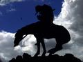
| 04/30/2004 11:31:58 AM | "Cherokee"by autoolComment: Greetings from the Critique Club!
The message
The silhouette successfully conveys the message of Fraser's famous sculpture, one of great sadness and depression. The sky appears to me to be clearing, a message of happiness and optimism. I suppose the clouds could be gathering, but the soaring bird and the direction the statue is facing give the impression that the storm is over. So to me the subject and background don't match, and there is no obvious reason for the irony.
Creative choices
The statue is positioned very nicely with respect to the clouds, although I think the picture would have been stronger if it was facing the other way (towards the clouds) and more clouds were included, increasing their drama and avoiding a centered composition. The perspective is great; shooting from below the sculpture increases the drama. Full color works well, although I think a sepia treatment would also have been effective.
Technical aspects
The exposure looks about right; the silhouette is black and there are only a few minor burned-out spots in the bright clouds. Levels and contrast are appropriate for the subject. The photo is well focused with just the right amount of sharpness. There seems to be more noise than I would expect with the low ISO and short exposure. It isn't troublesome or distracting; I'm just surprised to see it. | | Photographer found comment helpful. |
| 04/11/2004 10:38:57 AM | Chaos in the workshop!by maelmsComment: The lit open-end wrench and the large crescent wrench vie for the center of interest. Although poor composition for most photos, here it adds to the general chaotic feeling. I like it! |
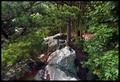
| 04/11/2004 10:10:24 AM | Descent Into Chaosby scalvertComment: My eye is nicely led down the rapids to the center of interest at about the middle of the large waterfall, which is unfortunately too close to the right edge of the photo. Otherwise a great photo. | | Photographer found comment helpful. |
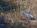
| 04/11/2004 10:04:01 AM | Habitatby GraciousComment: You've successfully put the center of interest on the habitat, where you intended. The bird is a contributing element, but doesn't grab attention. Well done! |
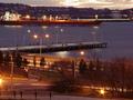
| 04/10/2004 12:12:03 PM | Ghostby oksamitComment: Greetings from the Critique Club!
The message
This is a peaceful scene of a harbor at sunset, and it conveys a nice feeling of the day's end. Although it does contain many instances of motion blurred car lights, they are incidental to the main message, making this a poor entry to the Motion Blur challenge.
Creative choices
The time of day is perfect: there is sufficient light from the setting sun to illuminate the harbor, but it's dark enough that the lights of night stand out. (Too bad a few hadn't come one yet.) The starlite effect on the lights is nice. The foreground distracts from the rest of the image; I think it would be better if either the bottom fourth was cropped off (giving a somewhat panoramic format) or the camera was tilted up some to include more of the sunset.
Technical aspects
The exposure is fine considering the impossible dynamic range of the scene. (A split neutral density filter might have helped.) The midtones are just right. | | Photographer found comment helpful. |
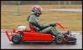
| 04/10/2004 11:25:31 AM | Driving Rainby ImagineerComment: Greetings from the Critique Club!
The message
Here is an intrepid racer, braving the elements in pursuit of his sport. The rain is apparent in the general wetness, the trails of water from the car, and the gloomy light. Great title.
Creative choices
Shooting in the rain made for a much more dramatic image than a similar one taken on a nice day would have been, both in the message and the quality of the light. The colors are great; the subject stands out nicely from the background. The motion blur combines with the DOF blur to make the background unobtrusive yet distinguishable enough to give context to the picture. A bit more motion blur would have given an impression of faster speed, but that wasn't the main intent of the photo and a longer exposure would have also made the engine more blurry, so I think the motion blur is just right. The composition is too tight, which makes the photo a bit boring. Some open space to the left would add some excitement, and some space above would provide better balance.
Technical aspects
Panning is well done. Focus and exposure are great. The white balance seems slightly off, giving a very minor color cast. |
|
Showing 371 - 380 of ~1171 |
Home -
Challenges -
Community -
League -
Photos -
Cameras -
Lenses -
Learn -
Help -
Terms of Use -
Privacy -
Top ^
DPChallenge, and website content and design, Copyright © 2001-2026 Challenging Technologies, LLC.
All digital photo copyrights belong to the photographers and may not be used without permission.
Current Server Time: 07/18/2026 05:47:39 AM EDT.
|