| Image |
Comment |
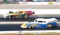
| 07/03/2004 11:52:54 AM |
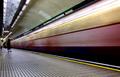
323mphby xcharrierComment: Great panning. Just the right amount of background motion blur. |
 Photographer found comment helpful. Photographer found comment helpful. |
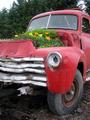
| 06/23/2004 11:13:44 PM |
Flower Powerby ElemmennopeComment: Greetings from the Critique Club!
The message
This is a great whimsical image! The colors and forms really grab attention. And there are a lot of contrasts, which make the photo very interesting.
Creative choices
Nice composition; the elements go well together without too much clutter, and takes advantage of the natural textures of the subject. The vertical format works well. There is a lot of glare from the overcast lighting; a polarizer may have reduced it, or choosing a sunnier day would have had even brighter colors.
Technical aspects
Technically well done. Good focus and fine exposure. Levels are fine, although darkening the midtones slightly may have helped counteract the glare. |
| Photographer found comment helpful. |
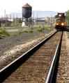
| 06/23/2004 08:02:07 PM |
Coming Through Townby drgsoellComment: Greetings from the Critique Club!
The message
The water tower grabs attention here; it has a lot of contrast with the sky and a unique shape. The train is a nice touch that adds context and ambience to the water tower, but even though the rails lead the eye to it, the train is too close to the edge to compete with the water tower.
Creative choices
The perspective here is great. The setting is nice, although the power poles are a bit distracting, as is the bright spot on the object below the water tower. Lighting isn't bad, but nothing special either; the sky is a bit bright.
Technical aspects
Focus and exposure are fine. The sharpness and blur on different parts is unnatural and a bit disconcerting; for example, the water tower and train are in focus although grass between them isn't. |
| Photographer found comment helpful. |
| 06/22/2004 11:57:04 PM |
so tiredby euclidsComment: Greetings from the Critique Club!
The message
The girls do appear to be waiting, so the photo is appropriate for the challenge. But people wait all the time; it's part of being human. And this picture doesn't convey anything special about waiting, so it's not very interesting.
Creative choices
The position of the models within the photo is great, and their expressions depict the tired, bored kind of waiting that was intended. But there are so many other elements that the photo is very cluttered. This draws attention away from the subject.
Technical aspects
There is a very slight green color cast (common with fluorescent and mercury vapor lighting) but it's barely noticable. Otherwise the photo is technically very well made; focus, exposure, and preparation for web display are all great. |
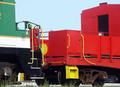
| 06/20/2004 10:59:14 AM |
The Colors of Trainsby wetlandComment: Great colors here. Nice shapes too. The sky is OK, but darker and bluer would have been nicer; a polarizer might have helped achieve this. |
| Photographer found comment helpful. |
| 06/20/2004 10:46:17 AM |
|
| Photographer found comment helpful. |
| 06/20/2004 10:43:09 AM |
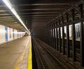
Mind the Gapby heidarthorComment: I think there is too much motion blur here. The character of the train is completely obscured. |
| Photographer found comment helpful. |
| 06/20/2004 10:33:10 AM |
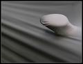
Negative Vibes, Man!by FalcComment: Interesting abstract, with a nice combination of smooth and jagged shapes. I'd prefer it a bit brighter, although that does change the overall feeling so may not convey the message you want it to. But the title seems to be a reference to the sixties culture, and pop art of that period used a generally bright palette. |
| Photographer found comment helpful. |
| 06/20/2004 10:11:07 AM |
Under Wrapsby e301Comment: A creative approach, with just enough detail to identify the subject, and some nice soft diagonal lines to add excitement. |
| Photographer found comment helpful. |
| 06/20/2004 09:59:18 AM |
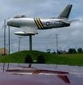
FU 21993by FrostyPawsComment: Nice subject. I love the reflection. The power poles are rather distracting; moving a meter or two to the left would have avoided the largest one, although I don't know if that was possible or what would have been included on the right. The compression artifacts could have been avoided by using a higher quality JPEG setting. |
| Photographer found comment helpful. |
Home -
Challenges -
Community -
League -
Photos -
Cameras -
Lenses -
Learn -
Help -
Terms of Use -
Privacy -
Top ^
DPChallenge, and website content and design, Copyright © 2001-2026 Challenging Technologies, LLC.
All digital photo copyrights belong to the photographers and may not be used without permission.
Current Server Time: 07/17/2026 03:44:54 PM EDT.