|
|
|
Showing 251 - 260 of ~1171 |
| Image |
Comment |
| 09/09/2004 09:54:17 PM | The Gingerbread Manby PixelstateComment: Greetings from the Critique Club!
This photo tells a definite story. The motion blur is perfect and "makes" the picture. Good lighting, and effective composition. A couple of minor distractions: the blurred/smeared sugar on his right side and the line (oven door?) in the background. But overall very creative and well done. |  Photographer found comment helpful. Photographer found comment helpful. |
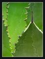
| 09/02/2004 12:14:14 AM | Cactusby arpitaComment: I like the way the designs on the plants is repeated by the negative shape on the left (the space outlined by the plants with their thorns). Very subtle and nice. The bright sun creates some bright spots that are somewhat distracting. The color works well, but I think this would also work well in black and white. |
| 09/02/2004 12:07:50 AM | Sunlit berriesby arpitaComment: The contrasting color of the berries really grabs attention here. I do wish both berries were in sharp focus. The diagonal lines in the background make the photo very dynamic. I also like the interesting shape of the shadows of the berry stems.
|
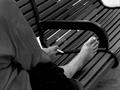
| 08/22/2004 01:58:06 PM | A bench called home.by BradComment: Greetings from the Critique Club!
Good concept here. The over-the-shoulder viewpoint and the focal length used arrange the elements together just right for a great composition. The exposure is fine, but the slow shutter speed captured some motion blur in the foot which is rather distracting. A higher ISO would have allowed a faster shutter speed and avoided this; the increased noise possible with higher ISO would also complement the image.
In a journalistic photo like this, post-processing can be a difficult choice. Artistically, the image would benefit from burning the bright toenail a bit, and perhaps some of the brighter areas between the bench slats as well. It may also be effective to darken the midtones to make the image even more low-key. But the image is also fine without these embellishments if a more "true" statement is desired. | | Photographer found comment helpful. |
| 08/22/2004 01:03:13 PM | Painted Mandalaby RoosterComment: Greetings from the Critique Club!
The painted feet make a striking image. They are nicely posed and the crop is perfect. The anklets complement the painting and are a great touch. The background is dark and subdued enough that it doesn't compete for attention with the subject (at least to me); I like the choice and the way the feet are placed in relation to it.
The lighting seems to work very well; it shows off the interesting texture of the wrinkled skin very nicely without leaving the shadows too dark. But the image is slightly overexposed, which has caused the painting to appear washed in some areas. What's tricky is that the overexposure is only in the red channel. The image has a nice warm color overall which certainly adds to the cozy feeling it conveys. But the camera adjusts the exposure for the overall luminosity, not for the individual channels or the redness that creates the warmth here.
Focus is great, and f/11 gave a large depth of field, keeping the background in sharp focus. This, I think, was the right choice for this image. The focus is somewhat soft and that works just fine even though I personally would prefer the feet to be just a little sharper to enhance the detail of the painting. | | Photographer found comment helpful. |
| 08/22/2004 11:49:20 AM | Tally Ho!by Spanish_GreaseComment: Greetings from the Critique Club!
A great photo. The simple composition is effective. Proportion and balance are just right. The overall effect is humorous and a bit zany. It seems a bit flat, partly because of the pure white background and partly because the shoes and socks are black so don't show any shadow. The lighting is fine; it subtly shows the form of the bare legs, and the unobtrusive reflections hint of the form of the shoes.
I may be wrong, but I'm guessing that the photo was underexposed and lightened during post-processing (the shoes have more noise than I would have expected). If so, exposing for detail in the shoes and socks might have captured some and given more depth to the image. Other technical aspects are great: focus, sharpness, color, etc. are all fine. |
| 08/20/2004 09:37:55 AM | Allureby dr rickComment: Great critique! Thanks.
And yes, this is a flower. |
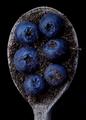
| 08/15/2004 11:53:49 PM | Blueberriesby Spanish_GreaseComment: Greetings from the Critique Club!
This is a great shot. I love it. It has nice shapes, forms, textures, and color: all combined to make a photo with a lot of impact. The black background is perfect. The dirt is controversial. I personally like it; it gives the image an earthy feel as well as makes viewers wonder why it is there. Very creative and technically perfect. |
| 08/15/2004 01:20:52 PM | Dumbleby morpurgoComment: Greetings from the Critique Club
The simplicity and unique point of view are what make this photo interesting. Nice balanced composition. The overall tone seems a bit light; I think making the dark parts a bit darker would add more impact. The blue color was obviously inspired by the challenge topic, and it does work well but at the same time it seems a bit artificial. A slightly different hue of blue would work better I think. (Or maybe an entirely different color, like gold, but that wouldn't meet the challenge!) Also, some of the specular highlights are a bit large; they would be less distracting if made a bit smaller, either by adjusting the lighting or some minor retouching in Photoshop.
Focus is great, with just the right depth of field; having the bases of the dumbbells slightly blurry is perfect, adding to the illusion that they are very tall. |
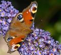
| 08/14/2004 11:28:33 PM | Vanessa Atalantaby hughletherenComment: Greetings from the Critique Club!
A great image of a beautiful insect. Focus is great, colors are perfect, DOF is adequate. The composition works; the diagonal lines add life and the subject is placed well within the frame. The point of view is conventional, showing off the whole butterfly without emphasizing any particular part. And it works fine; this is a great photo. But not special.
The one thing I don't particularly like about the photo is the sharpness of the flowers in the foreground. A little selective blurring (not too much!), or maybe even masking them out of the USM applications could have made them a little less obtrusive. |
|
Showing 251 - 260 of ~1171 |
Home -
Challenges -
Community -
League -
Photos -
Cameras -
Lenses -
Learn -
Help -
Terms of Use -
Privacy -
Top ^
DPChallenge, and website content and design, Copyright © 2001-2026 Challenging Technologies, LLC.
All digital photo copyrights belong to the photographers and may not be used without permission.
Current Server Time: 07/17/2026 12:29:54 PM EDT.
|