| Image |
Comment |
| 09/25/2004 10:27:51 AM |
Jump Kickby stupidcatComment: The composition is daring: centered vertically with elbow and toes so close to the edge of the frame. But it's nicely balanced and I think it works well. Not quite in focus though. |
 Photographer found comment helpful. Photographer found comment helpful. |
| 09/25/2004 10:14:25 AM |
Pit-Stopby spitz66Comment: Not a bad portrait of this car, but there is no action; nothing to imply it was moving when the photo was taken. |
| Photographer found comment helpful. |
| 09/25/2004 10:06:00 AM |
|
| Photographer found comment helpful. |
| 09/25/2004 09:57:04 AM |
At Playby katlynComment: The texture of the carpet is nicely captured, but I find it distracting. Also, a vertical format capturing more of the black and white dog might have been more effective. |
| Photographer found comment helpful. |
| 09/21/2004 11:49:04 PM |
Gulf Fritillary in the Late Afternoonby dipaulkComment: Greetings from the Critique Club!
This photo has a nice airy feeling, very appropriate for the subject. Color rendition is superb, and the bokeh (quality of the out-of-focus background) is great. The insect is captured in a great pose, with the nearby stalks adding context and interest without distracting from the subject. But the stalks near the top of the photo with the bright light compete for the viewer's attention; cropping them out would focus attention better on the butterfly.
The butterfly looks in focus, yet is lacking in sharpness. I think the cause is jpeg artifacts, which are prevalent. A higher quality setting would have eliminated most of them and probably improved the overall clarity. But even with this minor flaw, the photo is very pleasing and beautiful. |
| Photographer found comment helpful. |
| 09/11/2004 11:34:01 AM |
To keep us happyby yael27Comment: Greetings from the Critique Club!
The subject is certainly appropriate for the challenge, but this interpretation isn't very compelling. A vertical format would have worked better, not only having the entire figure included but allowing a more dynamic composition. An organic element such as a real plant would add interest as well. But the photo would benefit the most from more interesting lighting. Having the key light more to the side would better bring out the three dimensional form. |
| Photographer found comment helpful. |
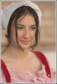
| 09/11/2004 11:03:31 AM |
...Some day my prince will come...by doctornickComment: Greetings from the Critique Club!
A great portrait! The model is beautiful and hope shines from her face. The lighting is perfect, with just enough soft shadow to define the graceful form of her face and providing nice glints in her eyes. Focus is nicely soft but the DOF is too narrow; an aperture one step smaller (f/4) would have put the whole subject in focus while still keeping the background unobtrusively blurry. But that's minor; it's a great photo as it is. |
| Photographer found comment helpful. |
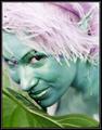
| 09/11/2004 10:38:25 AM |
Wood Elf by kosmikkreeperComment: Greetings from the Critique Club!
It looks like you snuck into Fairy Tale Land and took a candid shot of one of its inhabitants. The vignetting puts the focus of attention on the subject where it belongs while allowing the setting to provide useful context without unwanted distraction. It's a lot more effective than cropping would have been. The softness and saturated colors create the desired ethereal effect, although I personally think both are just a bit overdone. Overall, a wonderful photo, but you already knew that! |
| Photographer found comment helpful. |
| 09/09/2004 11:31:05 PM |
Secret Garden by mrorange002Comment: Greetings from the Critique Club!
A great photo, well deserving of a ribbon! The overall light tone fits the subject well, giving the desired fairy tale feeling. Focus is perfect and the shallow DOF adds depth and, combined with the large leaf, gives the impression of a macro shot of a small fairy. Very effective! Colors are perfect, as is the wonderfully impish expression.
Since you requested a critique, I'll point out the only problem I see, and it is very minor, not detracting from the overall image. The glare on the lips and, to a lesser extent, the nose is a bit bright. Discreet application of the Burn tool could tone it down to better match the rest of the image. |
| Photographer found comment helpful. |
| 09/09/2004 10:58:38 PM |
Periwinkleby librodoComment: Greetings from the Critique Club!
A beautiful portrait that shows off your signature ability to capture the souls of children. The model has a great pose and expression, and I like the hair covering half her face. The side of her nose is perhaps a bit bright; I find the contrast with the shadows a bit distracting. The photo is otherwise well-exposed. Her shoulder is even brighter, but that works well, giving the photo an overall light fairy tale look. Great photo! |
| Photographer found comment helpful. |
Home -
Challenges -
Community -
League -
Photos -
Cameras -
Lenses -
Learn -
Help -
Terms of Use -
Privacy -
Top ^
DPChallenge, and website content and design, Copyright © 2001-2026 Challenging Technologies, LLC.
All digital photo copyrights belong to the photographers and may not be used without permission.
Current Server Time: 07/17/2026 11:09:33 AM EDT.