|
|
|
Showing 101 - 110 of ~1171 |
| Image |
Comment |
| 02/27/2006 11:06:20 PM | Prideby Charlotte annComment: Greetings from the Critique Club
I must confess I really don't understand this photo. It's technically superb. The low key and slight color cast, with a shadow across one eye give it a rather sinister feeling. It's the opposite of your typical glamour shot, and not what normally comes to mind with the subject "pride". I guess it portrays the "deadly" side of pride, although it took me awhile to figure that out. But certainly a photo that makes one think.
I find the bright spot below her eyebrow distracting, and the one on her nose just mildly so. Given the overall fine control over the photo, I have to assume that this is intentional, but I don't understand its purpose.
Overall, a very well done photo. Not one to get a great score in DPChallenge since it takes too much time to understand it. But rewarding to anyone who takes that time. |  Photographer found comment helpful. Photographer found comment helpful. |
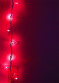
| 02/11/2006 11:13:24 AM | Red Lightsby ZenjohnComment: Greetings from the Critique Club.
I like the simplicity of this photo. The lights bring out the texture of the wall and form an interesting shape. But it is lacking a good focal point; the light switch is too low in the frame to be one, leaving the rather vague shape cast by the middle light, which is in a good place but just isn't very interesting.
It also isn't clear to me what message this photo is trying to convey. Red tends to evoke passion and energy, but the vertical line of the wires with the sinuous swath of illumination behind it suggest something closer to harmony or confidence. Stringing the lights diagonally would better suit the red color, or a blue color would better suit the vertical lights.
But on the positive side, the technical aspects of this photo (focus, exposure, etc.) are great. And the negative space on the right which is dark but not completely black works very well. | | Photographer found comment helpful. |
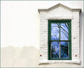
| 02/11/2006 10:34:15 AM | Reflections in the Window by docurrieComment: Greetings from the Critique Club.
A great photo, well deserving of a ribbon. The composition works very well, especially putting the subject off-center. The reflection is colorful and abstract, and certainly interesting but not really powerful enough to stand on its own. Embedding it in bland (although far from being devoid of interest) and concrete setting makes it stand out. The combination is far greater than its parts. Very well done. Congratuations! |
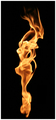
| 02/11/2006 09:30:56 AM | Ballerinaby gliphixComment: Such a nice form and great color! It doesn't need to be out of focus to be abstract, and I find the lack of focus distracting. | | Photographer found comment helpful. |
| 02/10/2006 11:56:15 PM | 1779, Never Beforeby ImagineerComment: The bright struts on the left attract attention due to their lightness, but they are out of focus so it is disappointing. Sorry, but this doesn't work for me. | | Photographer found comment helpful. |
| 02/10/2006 11:30:40 PM | | | Photographer found comment helpful. |
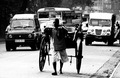
| 01/14/2006 11:55:41 PM | The City of Joyby abhraComment: Greetings from the Critique Club
This is a great photo. Shot at an opportune moment when the rickshaw was separated from the motor vehicles, it is a great illustration of the contrasts in that unique city. Color would have been distracting; black and white was a good choice. And using high tonal contrast to mirror the high city contrast works very well. The man's face isn't essential to the message of this photo, so the heavy shadow doesn't really bother me. |
| 01/14/2006 10:54:08 PM | Silhouetteby msieglerfrComment: Greetings from the Critique Club.
I love the gradient, and the texture of the sky is wonderful. The silhouetted building has an interesting shape. Focus is great. Exposure is just right. It is very attractive. So why doesn't this photo work better? I think it's because the two focal points (the brightest part of the sky and the cross on top of the building) are too close to the edges. Perhaps a vertical format would have worked better, both by giving more space around the focal points so they aren't crowded out, and because that orientation naturally produces more dynamic photos. | | Photographer found comment helpful. |
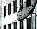
| 01/14/2006 11:54:28 AM | Multiple Portsby mthrgse49Comment: Greetings from the Critique Club
What I think you are trying to depict here is that modern city dwellers have many ways to connect with the world. At least that is what the title suggests, and the major elements of the photo are all related to this. Even the aspect ratio and smallish size are suggestive of a television picture. But I don't think it succeeds very well because, although the elements are there, they aren't really connected to each other. The satellite dish and windows are both obvious, but "point" in different directions. The junction box is there, but there isn't anything to tie it to the other elements.
I like the high contrast black and white approach. And the "halos" around the structures of the dish work here; although they look artificial (probably caused by oversharpening), they add a certain character that I find appealing. The problems I see with it are the less than perfect focus and the poor lighting which gives it a very flat appearance. |
| 01/13/2006 11:58:13 PM | Kisses...Mum!!by KitaComment: Greetings from the Critique Club
The impression I get from this photo is a mother who is kindly tolerent of the son she loves, but whose antics have made her a bit tired. It's an experience I'm sure all mothers are familiar with, and captured perfectly here. The high contrast, cool toned, monochrome treatment enhances this feeling and adds to the somewhat stiff pose and neutral expression. Great soft focus, good exposure, overall technically well done.
There are a couple of distracting elements: the boy's left arm (I assume) is motion blurred, so doesn't match the rest of the photo, and the pattern on the pillow; I think a solid color would have worked better. But these are minor; overall this is a very effective photo. | | Photographer found comment helpful. |
|
Showing 101 - 110 of ~1171 |
Home -
Challenges -
Community -
League -
Photos -
Cameras -
Lenses -
Learn -
Help -
Terms of Use -
Privacy -
Top ^
DPChallenge, and website content and design, Copyright © 2001-2026 Challenging Technologies, LLC.
All digital photo copyrights belong to the photographers and may not be used without permission.
Current Server Time: 07/17/2026 02:10:57 AM EDT.
|