| Image |
Comment |
| 09/14/2003 04:05:14 PM |
|
 Photographer found comment helpful. Photographer found comment helpful. |
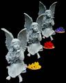
| 09/08/2003 12:27:00 AM |
Repeating Genesby sagestudioComment: Originally posted by dsidwell:
Super idea. I love the little boy's expression and elbow thing. The guy in the middle is kind of ugly, though. I'm sure his brother is much better looking. Does he have one? 8 |
Indeed the guy in the middle does have a brother! //dpchallenge.com/image.php?IMAGE_ID=35006 |
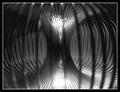
| 09/07/2003 09:47:20 AM |
Steel Spiralby moodvilleComment: Great concept and interesting image. The lighting is good and focusing on the far side was a good choice. Some minor imperfections: noise to the left of center and aliasing on some of the coils, a couple of bright spots, and the table edge is somewhat distracting. But overall well done. |
| Photographer found comment helpful. |
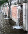
| 09/07/2003 09:33:29 AM |
Cascadeby indigo997Comment: You've used just the right shutter speed to get some motion blur in the waterfalls yet freeze capture the texture of the water surface. But the strong lines in the image lead the viewer's eye out of the photo, leaving him unsatisfied, wondering what's just beyond the border. |
| Photographer found comment helpful. |
| 09/06/2003 10:14:02 PM |
Design Differencesby FranziskaLangComment: So what appears to be repetition isn't really. And what should be vertical you've put diagonally. It works for me; I think this is a great photo. Creative composition and technically well done. |
| Photographer found comment helpful. |
| 09/06/2003 10:04:12 PM |
|
| Photographer found comment helpful. |
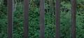
| 09/06/2003 08:55:19 PM |
Looking Outby kyrielleComment: There is certainly repetition, and the boards are interestingly different from each other, but the focused background is even more interesting and steals the viewers attention away. A shallow depth of field to knock the background out of focus would have helped prevent this. |
| Photographer found comment helpful. |
| 09/02/2003 10:37:31 PM |
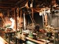
Machinist toolsby jeeptuningComment: This image breaks the rule that photos should have a center of interest in a very effective way. It invites the viewer to explore the different tools and the pulley system that connects them (both literally and as lines in the image). I wish it was a little sharper. It is unfortunate that the machinist is so washed out. |
| 09/02/2003 10:28:34 PM |
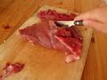
The Knifeby neatizzyComment: A larger knife would have made a more interesting image. The blurriness and pixelation are distracting, as is the meat at bottom left. |
| Photographer found comment helpful. |
| 09/02/2003 10:23:00 PM |
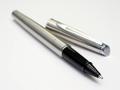
A Writer's Toolby CheerzComment: Nice lighting and composition, but ruined by the very shallow depth of field. It would be a nice portrait of a pen if it the whole thing was in focus. |
| Photographer found comment helpful. |
Home -
Challenges -
Community -
League -
Photos -
Cameras -
Lenses -
Learn -
Help -
Terms of Use -
Privacy -
Top ^
DPChallenge, and website content and design, Copyright © 2001-2026 Challenging Technologies, LLC.
All digital photo copyrights belong to the photographers and may not be used without permission.
Current Server Time: 07/17/2026 08:20:05 PM EDT.