| Image |
Comment |
| 02/20/2009 08:28:01 AM |
|
 Photographer found comment helpful. Photographer found comment helpful. |
| 02/17/2009 09:38:06 AM |
R E F L E C T I O N by essayComment: This is another one that I like the first time through, but has gotten better and better each time I look at it. I think being in with all the bright, loud colors of the other shots makes it look, at first, a little dark and not as interesting. However, each time I went through it stood out more and more. I like it very much! - 9 |
| Photographer found comment helpful. |
| 02/17/2009 09:36:37 AM |
Stackedby ElaineComment: I've gone through the photos about 5 times now before voting. I liked this very much the first time around. And though I liked a large number the first time, a number of the bright flashy ones have gone down in my estimation--this one just really pulls at me. I would have given it an 8 first time through--but I'm upping it to a 10 because of the fact that I'm more and more intrigued each time. Well done! |
| Photographer found comment helpful. |
| 02/17/2009 09:33:42 AM |
|
| 02/17/2009 08:48:58 AM |
Sweet!by hajekaComment: The first time through, I thought this was just a post-it note stuck to something. (I also did a shot with a single post-it note on something). Your shot has stayed consistently wonderful each time I look at it, while some other shots have lost my interest with multiple viewings. - 9 |
| Photographer found comment helpful. |
| 02/17/2009 08:39:45 AM |
Stop and Smell the Post-itsby limerickComment: wonderful bouquet! I can't make my mind up about the blue cast, however. I think it flats it out and cools it down too much. I would love to see what it would look like with warmer tones. - 8 |
| Photographer found comment helpful. |
| 02/16/2009 10:44:47 AM |
|
| Photographer found comment helpful. |
| 02/16/2009 10:40:10 AM |
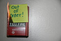
Out of orderby claudius1234Comment: I like the idea very much, but it wasn't immediately obvious that it was on fire... I'm not sure how to make the fire more obvious, perhaps letting it burn a little longer, or using a little less light (the highlight on the wall and the lower corner is washing things out a tad...) |
| Photographer found comment helpful. |
| 02/16/2009 10:38:17 AM |
What?by raishComment: I think it would look better a little darker--seems pretty light... |
| Photographer found comment helpful. |
| 02/16/2009 10:36:37 AM |
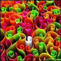
Stand Out From The Crowdby hotpastaComment: I like this very much, but the focus seems very soft--since there's so much movement, it would be more comfortable to look at if the focus was sharper. |
| Photographer found comment helpful. |
Home -
Challenges -
Community -
League -
Photos -
Cameras -
Lenses -
Learn -
Help -
Terms of Use -
Privacy -
Top ^
DPChallenge, and website content and design, Copyright © 2001-2026 Challenging Technologies, LLC.
All digital photo copyrights belong to the photographers and may not be used without permission.
Current Server Time: 07/23/2026 07:43:00 AM EDT.