| Image |
Comment |
| 02/22/2009 07:41:41 AM |
|
 Photographer found comment helpful. Photographer found comment helpful. |
| 02/20/2009 05:29:29 PM |
|
| Photographer found comment helpful. |
| 02/20/2009 05:23:31 PM |
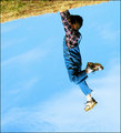
On Top of the Worldby limerickComment: You don't know how much it bothers me that he doesn't have anything he's standing on. (yes, I understand... but it still goes against the senses)
Great job! -- 9 |
| Photographer found comment helpful. |
| 02/20/2009 05:22:26 PM |
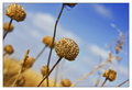
Sea Shore Shiftby tembaComment: I like it very much--the softness bothers my eyes a tad... with such nice lines, I would have liked it sharper. It's one that didn't make a strong intial reaction, but the more I looked at it, the more I liked it. |
| Photographer found comment helpful. |
| 02/20/2009 05:20:09 PM |
Good Morning Sunshineby chickadeezlComment: I think this is wonderful. I assume you're going to get hit for cutting off the feet. It bothers me a little, but I can live with it. Nice job! |
| Photographer found comment helpful. |
| 02/20/2009 05:11:16 PM |
Milk Quakeby rkupbensComment: I had this type of idea as well, but I was afraid that people would score it down because the horizon in the picture isn't tilted. I hope you're not having that problem! |
| 02/20/2009 05:06:30 PM |
|
| 02/20/2009 05:05:16 PM |
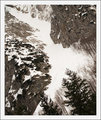
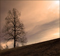
A Winter Breakby tfarrell23Comment: I really love the photo, but I would have scored it higher if you had found a way to artificially tilt the horizon. Since the tree is straight up and down, I assume this is just on a hill.
(I didn't score it low--it just would have been a very high score instead of a high one) |
| Photographer found comment helpful. |
| 02/20/2009 08:29:33 AM |
|
| Photographer found comment helpful. |
| 02/20/2009 08:28:50 AM |
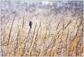
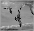
The Birdsby J-MeComment: nice shot. I like the seagull going off the edge, gives it movement |
| Photographer found comment helpful. |
Home -
Challenges -
Community -
League -
Photos -
Cameras -
Lenses -
Learn -
Help -
Terms of Use -
Privacy -
Top ^
DPChallenge, and website content and design, Copyright © 2001-2026 Challenging Technologies, LLC.
All digital photo copyrights belong to the photographers and may not be used without permission.
Current Server Time: 07/22/2026 11:42:11 AM EDT.