| Image |
Comment |
| 03/15/2009 02:03:47 PM |
The Westby android9Comment: Interesting shot--seems pretty squished on the right side... |
 Photographer found comment helpful. Photographer found comment helpful. |
| 03/15/2009 02:03:23 PM |
|
| Photographer found comment helpful. |
| 03/15/2009 02:02:58 PM |
Woosh!!!by mobsterComment: Very cool shot! I do think you could brighten up the highlights quite a bit without losing anything. Makes me wonder how you did it... |
| 03/15/2009 02:00:40 PM |
|
| Photographer found comment helpful. |
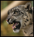
| 03/15/2009 01:59:32 PM |
Batmanby twitisComment: Interesting shot, the softer DOP makes the skin and eye look better, but it doesn't help the eye painting. I think more DOP would be better. |
| 03/15/2009 01:53:18 PM |
Looking for the African Sunby KarenNfldComment: I disagree with most of the comments--the blown out doesn't bother me at all--I love the shot. However, I think it would have been even better if you shot it from down low--more of the giraffe's point of view. |
| Photographer found comment helpful. |
| 03/14/2009 10:48:44 PM |
Ranschanby inamoComment: love the face. Wish it was a little sharper and the pipe in the background is distracting. The rest of the background is wonderful. |
| Photographer found comment helpful. |
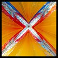
| 03/14/2009 10:47:12 PM |
Xby pheonix676Comment: very interesting--I wish I know more about it. |
| Photographer found comment helpful. |
| 03/14/2009 10:46:49 PM |
Precious Momentby kawesttexComment: I like it very much. Seems like you should have cut off the pony/pigtail a little more or a little less. Seems a tad uncomfortable cropped as it is. |
| Photographer found comment helpful. |
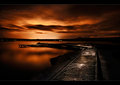
| 03/14/2009 10:45:55 PM |
Sailing Homeby TitiaComment: Very nice shot. I brought it into photoshop, and it does seem like you could bring out the sun rays a little more and get a little more depth/contrast from the sky. |
| Photographer found comment helpful. |
Home -
Challenges -
Community -
League -
Photos -
Cameras -
Lenses -
Learn -
Help -
Terms of Use -
Privacy -
Top ^
DPChallenge, and website content and design, Copyright © 2001-2026 Challenging Technologies, LLC.
All digital photo copyrights belong to the photographers and may not be used without permission.
Current Server Time: 07/24/2026 10:18:36 AM EDT.