| Image |
Comment |
| 03/27/2009 06:40:35 PM |
|
 Photographer found comment helpful. Photographer found comment helpful. |
| 03/27/2009 06:40:32 PM |
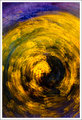
Color in Motion by pearlseyesComment: Very interesting! It seems like it should be obvious what it is, but I can't figure it out. I hope you give us the details! One of my favs. |
| Photographer found comment helpful. |
| 03/27/2009 06:40:12 PM |
Desert in Bloomby edmengComment: Absolutely wonderful! couldn't think of a thing to change. I especially like the bits of purple. I'm thinking I might know how you did this--and I want to try it. But I hope you put the details up for us. |
| Photographer found comment helpful. |
| 03/27/2009 06:40:05 PM |
Bus Stopby dandrestorComment: Cool! Abstract enough for me! very interesting shot. I like the starbursts on the lights. |
| Photographer found comment helpful. |
| 03/26/2009 02:56:22 PM |
|
| 03/26/2009 02:54:19 PM |
Whats Buzzing around!by csolomon1Comment: It's a very nice photo, and I like it a lot. But it doesn't seem abstract at all to me, and there's very little motion. I hate marking it down, because I do like it, but it doesn't seem to fit the challenge. |
| 03/26/2009 02:49:31 PM |
|
| Photographer found comment helpful. |
| 03/25/2009 01:42:31 PM |
|
| Photographer found comment helpful. |
| 03/25/2009 01:38:54 PM |
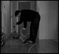
The Installerby QuigleyComment: It's interesting, but not very abstract. It also seems a little dark. |
| Photographer found comment helpful. |
| 03/25/2009 01:26:20 PM |
Objects in Mirror are Closer...by dtremainComment: Interesting idea, and abstract enough for the challenge, but it doesn't catch my interest very much. Perhaps if it wasn't so bright on the left side and you played with the contrast a little more... |
| Photographer found comment helpful. |
Home -
Challenges -
Community -
League -
Photos -
Cameras -
Lenses -
Learn -
Help -
Terms of Use -
Privacy -
Top ^
DPChallenge, and website content and design, Copyright © 2001-2026 Challenging Technologies, LLC.
All digital photo copyrights belong to the photographers and may not be used without permission.
Current Server Time: 07/24/2026 01:55:39 PM EDT.