| Image |
Comment |
| 08/22/2009 12:17:05 AM |
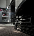
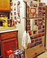
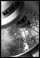
That Thing at the Bottomby colorcarnivalComment: Interesting shot, but I'm finding the things on the left hand side of the picture to be distracting. Maybe if you had desaturated the reds and blues (cyans?) it might have helped. |
 Photographer found comment helpful. Photographer found comment helpful. |
| 08/22/2009 12:14:27 AM |
|
| Photographer found comment helpful. |
| 08/22/2009 12:13:54 AM |
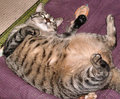
Home Entertainment Center {Cat Nip Not Included}by TatorDComment: I like the humor, but I'm sorry, I just can't see a cat fitting my definition of an appliance: "A device or instrument designed to perform a specific function, especially an electrical device, such as a toaster, for household use." and even though he/she certainly performs a specific function, it's just not a device or instrument. Sorry! |
| 08/22/2009 12:08:39 AM |
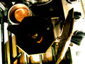
Campfireby lynnclevelyComment: interesting idea. Your colors seem to be rather oversaturated. Undersaturating, or even b&w with sepia might give it an even more "used up" feel. |
| 08/22/2009 12:07:15 AM |
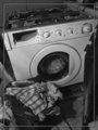
Mourning Laundryby kivgaenComment: I don't care for the inner border. I think it would be stronger without it. I do like the chaos and the angle, however! Seems a tad pale. Did you play a little more contrast? I'd be curious if more contrast would hurt or help the photo... |
| Photographer found comment helpful. |
| 08/22/2009 12:05:18 AM |
Vacuum by JayTroopComment: I really like the idea, but it's quite there, imo. The swoop of brushes in the middle two squares is actually quite interesting. If you had moved the shot over a tad to the right and gotten the start of the next swoop, it might have been more interesting.
Also, usually the rollers are pretty black, did you try playing with the levels to get a little more contrast? 5 |
| 08/22/2009 12:01:23 AM |
Where did the Coffee go?by LMJswim7Comment: I like the angle and the colors. But if they pot is empty, it's very hard to tell on my screen. Nice idea, but not quite there in my mind -- 5 |
| Photographer found comment helpful. |
| 08/22/2009 12:00:10 AM |
Sew me..by chestomComment: The very shallow depth of field on the needle is very distracting (imo). It doesn't work well for me, because it's a strange setup. The hand sewing needle and the lack of needle on the machine doesn't make a lot of sense in the still life, because they really don't go together (unless the needle is there because the sewing machine doesn't work anymore). It was a good effort, though. (last thing--I think the picture would be much stronger without the border. I don't vote on borders, but some people do...) 5 |
| Photographer found comment helpful. |
| 08/21/2009 11:53:10 PM |
rifby whiterookComment: Rif? sorry -- don't get the title. I looked it up, and all I found was "reading is fundamental".
I like this very much. I like the old photograph feel of the processing. Nice job. 7 |
| Photographer found comment helpful. |
| 08/21/2009 11:49:20 PM |
|
| Photographer found comment helpful. |
Home -
Challenges -
Community -
League -
Photos -
Cameras -
Lenses -
Learn -
Help -
Terms of Use -
Privacy -
Top ^
DPChallenge, and website content and design, Copyright © 2001-2026 Challenging Technologies, LLC.
All digital photo copyrights belong to the photographers and may not be used without permission.
Current Server Time: 07/27/2026 11:10:07 AM EDT.