| Image |
Comment |
| 09/14/2009 08:33:19 PM |
World Windowsby posthumousComment: I found this one quite fascinating. I really couldn't tell if the white streak was just a very bright beam, or what. But it made you look and look again. And the rest of it had such a dreamy quality, that it just pulled you in. |
 Photographer found comment helpful. Photographer found comment helpful. |
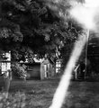
| 09/14/2009 08:30:50 PM |
Playing bridge?by snafflesComment: Fun shot! And I think they're hidden just fine! I like this level of waldo so much better than the ones that were next to impossible. I wonder if I would have the guts to jump. But then I thought, if everyone else was jumping off a bridge... :D |
| Photographer found comment helpful. |
| 09/14/2009 08:28:37 PM |
Sunset on the Beachby BrianRComment: This is a really neat shot--it is such an interesting tangled mess, and it was a challenge to find Waldo! Yet after you found him, you had no idea how you missed him in the first place!! Wonderfully done! |
| Photographer found comment helpful. |
| 09/14/2009 08:24:46 AM |
|
| Photographer found comment helpful. |
| 09/14/2009 06:17:25 AM |
back alley by timfythetooComment: Haha! I knew you were trouble as soon as I saw your name! Congrats on the ribbon--wonderful shot! I'd pay $25 for a ribbon as well! |
| Photographer found comment helpful. |
| 09/14/2009 12:09:57 AM |
A Seat With a Viewby SandyPComment: we did it!! We made top 10!! You probably would have beat me if you entered the more processed one. (my husband saw yours and said "oooh! I like that!) |
| Photographer found comment helpful. |
| 09/14/2009 12:03:21 AM |
Unlikely Forest by Covert_OddityComment: hooray!! This was the one I moved up to a 10 a minute before midnight. Absolutely love this!! congrats! |
| Photographer found comment helpful. |
| 09/13/2009 09:27:32 PM |
|
| Photographer found comment helpful. |
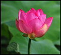
| 09/13/2009 08:47:41 AM |
Lotusby KatheComment: love the light on this one. Beautiful glowing colors! |
| Photographer found comment helpful. |
| 09/12/2009 08:09:42 PM |
Ephemeralby bspurgeonComment: This gets more wonderful the more you see it. Was just looking through the challenge photos and came across it again. Gave it an 8 during the challenge, I'd move it to a 9 or 10 now! Wonderfully done! |
| Photographer found comment helpful. |
Home -
Challenges -
Community -
League -
Photos -
Cameras -
Lenses -
Learn -
Help -
Terms of Use -
Privacy -
Top ^
DPChallenge, and website content and design, Copyright © 2001-2026 Challenging Technologies, LLC.
All digital photo copyrights belong to the photographers and may not be used without permission.
Current Server Time: 07/28/2026 12:59:27 AM EDT.