| Image |
Comment |
| 02/01/2010 03:37:03 PM |
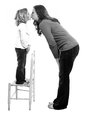
Refugeby PhilComment: aww! And now they announce a chair challenge!
Fun shot, very nicely done. |
 Photographer found comment helpful. Photographer found comment helpful. |
| 02/01/2010 03:36:25 PM |
|
| Photographer found comment helpful. |
| 02/01/2010 03:33:47 PM |
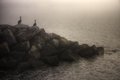
Pelican Bayby mgarsteckComment: Like your other shot better. This one's nice, but since their heads are looking away, it makes them look kind of headless. |
| Photographer found comment helpful. |
| 02/01/2010 03:32:38 PM |
|
| Photographer found comment helpful. |
| 02/01/2010 09:12:15 AM |
|
| Photographer found comment helpful. |
| 02/01/2010 09:10:10 AM |
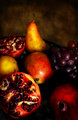
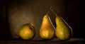
La Fruttaby loveComment: I thought there was something very appealing about this photo. I like the richness a just a tad abstract.
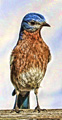
Here's a bluebird for you!
 Posthumous thread
 |
| Photographer found comment helpful. |
| 02/01/2010 09:08:10 AM |
|
| Photographer found comment helpful. |
| 02/01/2010 09:06:53 AM |
|
| 02/01/2010 09:05:20 AM |
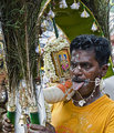
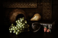
Bronzeby fotofanComment: What wonderful textures and soft, moody lighting! Congrats on your HM! |
| Photographer found comment helpful. |
| 02/01/2010 09:04:03 AM |
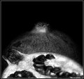
aloneby mpetersComment: Congrats on the top 10! I love the warmth and light in this shot! |
| Photographer found comment helpful. |
Home -
Challenges -
Community -
League -
Photos -
Cameras -
Lenses -
Learn -
Help -
Terms of Use -
Privacy -
Top ^
DPChallenge, and website content and design, Copyright © 2001-2026 Challenging Technologies, LLC.
All digital photo copyrights belong to the photographers and may not be used without permission.
Current Server Time: 05/08/2026 06:16:09 PM EDT.