| Image |
Comment |
| 12/20/2013 07:24:17 PM |
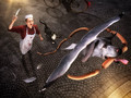
Thief! by gyabanComment: congrats on 100!!! Stand still for awhile so I can catch up with you!!
I love the stories that you tell with your images, Christophe. And I love your back stories, too. I thought about doing the same type of thing, from above (I can get seagulls from above on the ferry), but I knew that I'd have too much of a problem with the rest of it.
You do of course realize that the cat is the star of this, don't you? He better have gotten some extra treats with dinner, or I'll tell the union... :)
|
 Photographer found comment helpful. Photographer found comment helpful. |
| 12/19/2013 05:25:57 AM |
|
| Photographer found comment helpful. |
| 12/19/2013 05:25:29 AM |
|
| Photographer found comment helpful. |
| 12/19/2013 05:24:04 AM |
|
| Photographer found comment helpful. |
| 12/19/2013 05:23:21 AM |
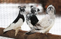
Thief!by gyabanComment: Absolutely adore the idea and the humor, not crazy about the bird/dog blend. Seems like the head's way to big to fly. :)
But great fun anyway. -6- |
| Photographer found comment helpful. |
| 12/19/2013 05:21:06 AM |
|
| Photographer found comment helpful. |
| 12/19/2013 05:20:29 AM |
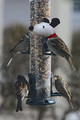
They Finally Found Their Wingsby cynthiannComment: I really like this one, but I wish you would have adjusted the colors so they went together. Such awesome captures of the birds, but it doesn't work very well, because it looks too pasted together. 6 though, because of the great bird captures. :) |
| Photographer found comment helpful. |
| 12/04/2013 06:57:29 AM |
|
| Photographer found comment helpful. |
| 12/02/2013 10:33:24 AM |
|
| Photographer found comment helpful. |
| 12/02/2013 09:48:27 AM |
Agingby MargaretNetComment: What a shame that you hate it!! I was thinking what beautiful things you've been coming up with, and that I like how your style has been changing up a bit. This is truly gorgeous.
ah -- someone pointed out that you probably meant you hated aging, not your photo. :)
(It's another migraine day, so I'm not thinking too clearly. :) Message edited by author 2013-12-02 12:28:14. |
| Photographer found comment helpful. |
Home -
Challenges -
Community -
League -
Photos -
Cameras -
Lenses -
Learn -
Help -
Terms of Use -
Privacy -
Top ^
DPChallenge, and website content and design, Copyright © 2001-2026 Challenging Technologies, LLC.
All digital photo copyrights belong to the photographers and may not be used without permission.
Current Server Time: 07/17/2026 12:57:32 AM EDT.