| Image |
Comment |
| 01/16/2014 11:10:20 PM |
|
 Photographer found comment helpful. Photographer found comment helpful. |
| 01/08/2014 12:10:57 AM |
|
| Photographer found comment helpful. |
| 01/06/2014 01:57:51 PM |
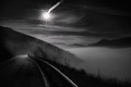
Solstice Omen by Alex_PetriniComment: whoa!!! No votes below 6?? That's so awesome!!!!
And look at the average of the commenters!
Huge congrats on your 8! |
| Photographer found comment helpful. |
| 12/27/2013 01:00:05 PM |
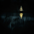
Silent Night (Feliz Naviduck)by vawendyComment: Originally posted by kasaba:
although I have no idea what "time" this translates into for you :-). |
Got there about 6:15 and the shot was taken at about 6:50.
|
| 12/27/2013 12:57:42 PM |
Silent Night (Feliz Naviduck)by vawendyComment: Originally posted by hahn23:
While it's hard to say for sure the id of the waterfowl, my best guess, based on silhouette would be a Common Loon. |
We've never seen loons in our ponds, even though they winter in the tidewater region. It is probably a smaller than a loon or a cormorant, but was a kind of diving duck. It popped up in the reflection and dove again quickly. It was only in 3 frames before it dove. |
| 12/27/2013 12:51:31 PM |
Silent Night (Feliz Naviduck)by vawendyComment: Originally posted by vawendy:
I only used one of the three exposures in this image. The bracketing was because I was unsure of what exposure I would need. |
typed by Jeff since Wendy is making lefse! Message edited by author 2013-12-27 12:51:57. |
| 12/27/2013 12:48:25 PM |
Silent Night (Feliz Naviduck)by vawendyComment: Originally posted by gyaban:
Originally posted by Venser:
if the duck was traversing the scene and in a different location for each exposure, I don't see how this can't get DQ'ed given the precedence set before it. |
The submitted image is probably the result of only one of the three shots (at least it seems perfectly doable, editing-wise), in which case there shouldn't be any problem with validation. |
I only used one of the three exposures in this image. The bracketing was because I was unsure of what exposure I would need.
|
| 12/22/2013 07:14:07 AM |
|
| Photographer found comment helpful. |
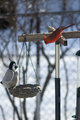
| 12/22/2013 07:13:33 AM |
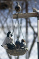
welcome!!!by PennyStreetComment: he has a friend!!!
(I can't have this feeder -- or the squirrels would get rreeeeeaaaaly fat!) |
| Photographer found comment helpful. |
| 12/22/2013 07:12:17 AM |
|
| Photographer found comment helpful. |
Home -
Challenges -
Community -
League -
Photos -
Cameras -
Lenses -
Learn -
Help -
Terms of Use -
Privacy -
Top ^
DPChallenge, and website content and design, Copyright © 2001-2026 Challenging Technologies, LLC.
All digital photo copyrights belong to the photographers and may not be used without permission.
Current Server Time: 07/16/2026 09:14:13 PM EDT.