|
|
|
Showing 1911 - 1920 of ~7714 |
| Image |
Comment |
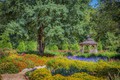
| 02/19/2015 03:21:49 PM | Summer in the Parkby ElaineComment: It's a gorgeous shot, and very well done. However, imo, art is something that is intriguing, elusive, curious, annoying, or something of that kind. Something that makes you feel something. Something that makes you want to look at it again and again. This is a beautifully done photograph, but it seems more documentary than art (even though it's processed beautifully.) It's lovely, but there's nothing in it that makes me want to explore or see it again and again. |  Photographer found comment helpful. Photographer found comment helpful. |
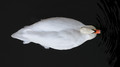
| 02/19/2015 03:19:02 PM | Overheadby DistantColoursComment: I'm torn on this one. I didn't like it at first. Just didn't call to me. It got more interesting as I looked at it. The head is so small compared to the body that it's interesting, yet kind of annoying (not that you can do anything about it -- more for the balance of the photo). I'm not sure that it's art, by my definition, but it's still funky enough for a 6. | | Photographer found comment helpful. |
| 02/19/2015 03:17:34 PM | ...killer instinct...by SistoComment: My first thought was -- hey that's pretty cool. I like the high key. It's intriguing. But then subtle things began bothering me a bit. The nose being basically completely gone except the nostrils (yes, a little around the sides) but the bridge being completely gone made the nostrils look kind of bizarre. It seems bottom heavy. Maybe less knife? Funny thing is, I like the shadow on the neck. 7 for the initial impact, but I'm not sure it has the staying power for a higher score. | | Photographer found comment helpful. |
| 02/19/2015 11:39:40 AM | <4>by mpetersComment: This is so close, imo, but not quite there. The light is intriguing, but I think a little too washed out to make it exciting. There's a lot to explore: the sagging shoulder strap, wondering what she's reading, her expression, the background. But the lighting/processing just falls a bit flat for me. 6 | | Photographer found comment helpful. |
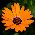
| 02/19/2015 11:37:48 AM | 2014-1by WagonwheelComment: I can see why you like this one. The oranges, the greens, and the touch of purple is a lovely combination. However, this doesn't really fit "art" in my mind.
I've been kicking around the idea of what is art. I'm one of those sorely lacking in any formal background. To me, art is something that transcends the norm. Something that makes you feel, think -- something that intrigues you, makes you want to go back and explore deeper and deeper and deeper. Something that haunts you, excites you, makes you feel something.
While this is lovely, it goes in the category of more journaling a pretty flower. There are so many gorgeous flower pictures, but it's rare that they make me feel anything but "what a lovely flower".  ursula ursula I think is an incredible example of creating art with flower. | | Photographer found comment helpful. |
| 02/19/2015 11:30:35 AM | Doorby sfaliceComment: It's a nice find. I like the streaks of color. I like the rusted lock and hinge. It's intriguing and I can see why you photographed it.
I'm thinking a 6 for the following reasons: intriguing, lovely colors, interesting movement. Why it's not higher: I'm not finding anything deeper to it. It draws you in nicely, but it doesn't keep you. Once you've explored it, I think you'd end up being done. To me art is a continual discover or joy. Something that draws you back. Something that gives you joy, anguish, excitement, etc. each time you see it. | | Photographer found comment helpful. |
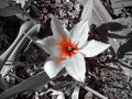
| 02/19/2015 11:24:49 AM | Orange is the new Black!by MonaComment: I've been kicking around the idea of what is art. I'm one of those sorely lacking in any formal background. To me, art is something that transcends the norm. Something that makes you feel, think -- something that intrigues you, makes you want to go back and explore deeper and deeper and deeper. Something that haunts you.
That being said, I'm sorry, but this doesn't work for me. Selective desat is so hard to do effectively. I'm thinking that the orange maybe is too bright? it just draws you in, but doesn't go anywhere. The background is extremely busy, but again, there's not much in the busy to make you want to explore. The lighting is quite harsh and is distracting. It's an interesting effort, but falls flat for me.
Sorry... | | Photographer found comment helpful. |
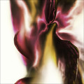
| 02/19/2015 11:19:52 AM | Satin on Whiteby chaliceComment: This is quite beautiful. I expected there to be a lot of "blurry mess" photos. For them to work for me, it needs nice movement, colors, and intrigue. I'm not sure that it would hold up over time, but makes a beautiful first impression. There's an inner glow to it that's quite striking. Nicely done. | | Photographer found comment helpful. |
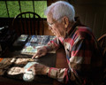
| 02/12/2015 08:55:34 AM | The Way We Were by grahamgatorComment: This is such a wonderful portrait. I actually really like the shadows because it gives it more warmth and reality. I'm so sorry for your loss. :( | | Photographer found comment helpful. |
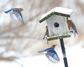
| 02/12/2015 08:00:44 AM | Bluebird Stationby cloudsmeComment: This is so incredibly gorgeous!!! Unbelievably gorgeous! I'd be jumping up and down for a month if I got a shot like this. Huge, huge congrats! | | Photographer found comment helpful. |
|
Showing 1911 - 1920 of ~7714 |
Home -
Challenges -
Community -
League -
Photos -
Cameras -
Lenses -
Learn -
Help -
Terms of Use -
Privacy -
Top ^
DPChallenge, and website content and design, Copyright © 2001-2026 Challenging Technologies, LLC.
All digital photo copyrights belong to the photographers and may not be used without permission.
Current Server Time: 06/24/2026 06:43:00 PM EDT.
|