| Image |
Comment |
| 07/02/2015 08:34:42 PM |
Mindbottlingby mindbottlingComment: haha!!! What a great expression on both, but especially the one in the back!!! Great catch! |
 Photographer found comment helpful. Photographer found comment helpful. |
| 07/02/2015 08:34:16 PM |
|
| Photographer found comment helpful. |
| 07/02/2015 08:33:38 PM |
|
| Photographer found comment helpful. |
| 07/02/2015 08:32:51 PM |
|
| Photographer found comment helpful. |
| 07/02/2015 08:31:51 PM |
RKTby RKTComment: Fascinating shot! I thought that the first time I went through, and even more so now. Really well done. |
| Photographer found comment helpful. |
| 07/02/2015 08:31:18 PM |
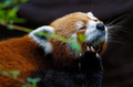
P-A-U-L by P-A-U-LComment: Not sheep? Awwww....! But what a wonderful face! I still need to figure out how you do your shots. I have sheep around here, and I'd love it to turn out like yours! |
| Photographer found comment helpful. |
| 07/02/2015 08:30:22 PM |
MaryOby MaryOComment: I recognize that face!! I don't know why they're not in every challenge. They're so soulful! Nice on the backlighting. |
| Photographer found comment helpful. |
| 07/02/2015 08:29:15 PM |
|
| Photographer found comment helpful. |
| 07/02/2015 08:28:51 PM |
Bear_Musicby Bear_MusicComment: I figured you'd pick boats, but I wouldn't have pegged this scene as yours. I think of your stuff as a tad softer. Maybe it's because there's so many wonderful sunrises and sunsets. I do like the Hero, though. :) |
| Photographer found comment helpful. |
| 07/02/2015 08:27:37 PM |
|
| Photographer found comment helpful. |
Home -
Challenges -
Community -
League -
Photos -
Cameras -
Lenses -
Learn -
Help -
Terms of Use -
Privacy -
Top ^
DPChallenge, and website content and design, Copyright © 2001-2026 Challenging Technologies, LLC.
All digital photo copyrights belong to the photographers and may not be used without permission.
Current Server Time: 06/24/2026 12:45:33 PM EDT.