| Image |
Comment |
| 09/22/2012 01:56:03 PM |
|
 Photographer found comment helpful. Photographer found comment helpful. |
| 09/11/2012 11:53:43 PM |
|
| Photographer found comment helpful. |
| 09/10/2012 03:41:07 PM |
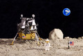
R.I.P Neil Armstrongby GilesComment: Very nice work with the set-up and the focus-stacking.
I wonder if the neon coloration of the Earth bothered some voters, or if it was the lack of an actual image of the Moon, because it should have scored much better IMO. |
| Photographer found comment helpful. |
| 09/09/2012 02:01:12 PM |
|
| Photographer found comment helpful. |
| 09/06/2012 03:13:58 PM |
Waiting for her returnby markwileyComment: I think I'd tone down or just tone (add more color) just slightly to the very brightest highlights on the forehead. Right now they make me focus too much on just that part rather than her whole face.
Otherwise I like the use of light and negative space, pretty good capture of the emotion of the moment. |
| Photographer found comment helpful. |
| 09/02/2012 05:10:44 PM |
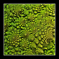
Romanesco Cauliflower by ThingFishComment: Your version certainly fared better than mine, possibly the smaller structure of the flowers — congratulations!
Thanks you for the explanation of the Fibonacci spiral -- I've been wondering about how that worked for a while. |
| Photographer found comment helpful. |
| 08/08/2012 11:09:06 PM |
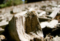
Clear-Cutby GeneralEComment: Originally posted by MinsoPhoto:
wow mulch? I actually thought this was a stump. Stumped me :) |
Here are a couple of other views which make it more obvious what it really is. I was afraid the tiny bit of spiderweb I left in might give it away ... :-)
  |
| 06/14/2012 04:11:49 PM |
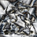
Floaties°by JamesDowningComment: Right off this reminded me of one I took a while ago ... in comparison to your picture I chose to create a more "colorful" (but perhaps less realistic-looking) version, and I used the circular vignette to try and give the impression of a micro-photograph. Otherwise, you did a nice job capturing the details and textures.
 |
| Photographer found comment helpful. |
| 06/06/2012 01:34:14 AM |
|
| Photographer found comment helpful. |
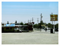
| 05/08/2012 01:45:20 PM |
Best Food In Townby GeneralEComment: Originally posted by posthumous:
I was also reminded of Stephen Shore and similar photographers. I almost hung it in the gallery. |
Dang! So close ... serious, this whole batch of comments is really appreciated -- that old, slightly faded color slide/print look is just what I was trying for; I thought it matched the subject matter.
I also like that it's a capture of a one-time opportunity, being shot from a high seat in a bus, which was briefly stopped at an intersection, and which it's not that likely I'll be riding again.
I'll have to look up Stephen Shore -- I'm not familiar with his work ... OK, maybe you were thinking of something like this?
For contrast (sic), here is the "original" edit of this shot, before desaturation 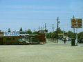 Message edited by author 2012-05-08 14:05:08. Message edited by author 2012-05-08 14:05:08. |
Home -
Challenges -
Community -
League -
Photos -
Cameras -
Lenses -
Learn -
Help -
Terms of Use -
Privacy -
Top ^
DPChallenge, and website content and design, Copyright © 2001-2026 Challenging Technologies, LLC.
All digital photo copyrights belong to the photographers and may not be used without permission.
Current Server Time: 06/17/2026 10:52:30 PM EDT.