| Image |
Comment |
| 04/19/2013 12:57:39 PM |
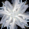
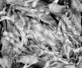
04663by pixelpigComment: Looks like it's made of sheer fabric, a nice effect! |
 Photographer found comment helpful. Photographer found comment helpful. |
| 04/17/2013 01:16:52 PM |
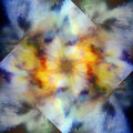
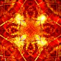
04918by pixelpigComment: Reminds me of the tie-dyed T-shirts I see for sale all the time on Telegraph Avenue in Berkeley. |
| Photographer found comment helpful. |
| 04/17/2013 01:08:50 PM |
|
| Photographer found comment helpful. |
| 04/17/2013 01:06:59 PM |
|
| Photographer found comment helpful. |
| 04/15/2013 02:26:24 PM |
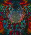
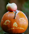
04976by pixelpigComment: Reminds me of the amorphous flying spirits from the "Night On Bald Mountain" segment near the end of the movie Fantasia. |
| Photographer found comment helpful. |
| 04/15/2013 02:24:25 PM |
|
| Photographer found comment helpful. |
| 04/12/2013 05:21:39 PM |
|
| Photographer found comment helpful. |
| 04/12/2013 02:00:56 PM |
A Shocker In L.A.by GeneralEComment: Originally posted by hajeka:
Not my top pick in the FS, but I always hate to see a DQ. Looks like  posthumous has his brown now :) posthumous has his brown now :) |
FWIW I (obviously) think the DQ is BS, but not worth arguing about ... :-( |
| 04/11/2013 06:27:29 PM |
|
| Photographer found comment helpful. |
| 03/29/2013 04:11:38 PM |
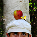
William Tell Style Archery by MikeComment: Congratulations! I didn't even enter this challenge, but I've used this theme before with pretty good results -- you did even better. Great work!
  |
Home -
Challenges -
Community -
League -
Photos -
Cameras -
Lenses -
Learn -
Help -
Terms of Use -
Privacy -
Top ^
DPChallenge, and website content and design, Copyright © 2001-2026 Challenging Technologies, LLC.
All digital photo copyrights belong to the photographers and may not be used without permission.
Current Server Time: 06/18/2026 12:48:54 AM EDT.