| Image |
Comment |
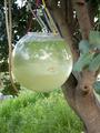
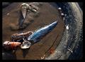
| 04/27/2003 10:11:15 PM |
Hanging fish bowlby deadbrainComment: Getting closer and cropping tighter would give you a fantastic surreal shot of the goldfish swimming in the meadow... |
 Photographer found comment helpful. Photographer found comment helpful. |
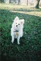
| 04/27/2003 07:29:56 PM |
|
| Photographer found comment helpful. |
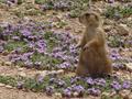
| 04/27/2003 07:26:53 PM |
UseToBeby CarlaAnnComment: If you have to crop really small, you might try resampling up to a larger display size. If you're not familiar with this, check out the DPC Tutorial at
//www.dpchallenge.com/tutorial.php?TUTORIAL_ID=8 |
| 04/27/2003 07:25:13 PM |
Horsepowerby willtataComment: Probably the first time a lot of us have seen draft horses at work outside of a Bud commercial... |
| Photographer found comment helpful. |
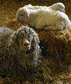
| 04/27/2003 07:21:02 PM |
Proud Mamaby cpanaiotiComment: You might try re-sampling the image to make your desired crop display larger -- there's free/cheap software available that will do a fine job. If you're not familiar with resampling, check out the DPC Tutorial at this URL:
//www.dpchallenge.com/tutorial.php?TUTORIAL_ID=8 |
| Photographer found comment helpful. |
| 04/27/2003 07:13:39 PM |
|
| Photographer found comment helpful. |
| 04/27/2003 07:09:04 PM |
|
| Photographer found comment helpful. |
| 04/27/2003 07:07:27 PM |
|
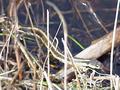
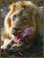
| 04/27/2003 05:58:24 PM |
African faunaby marboComment: Doesn't look like he wants to share it with you. I think I'd have chosen a black outer border. |
| Photographer found comment helpful. |
| 04/27/2003 05:53:44 PM |
|
Home -
Challenges -
Community -
League -
Photos -
Cameras -
Lenses -
Learn -
Help -
Terms of Use -
Privacy -
Top ^
DPChallenge, and website content and design, Copyright © 2001-2026 Challenging Technologies, LLC.
All digital photo copyrights belong to the photographers and may not be used without permission.
Current Server Time: 06/21/2026 05:24:25 AM EDT.