| Image |
Comment |
| 05/31/2003 10:54:37 PM |
Whitneyby draney4Comment: Brightest highlights slightly blown-out, but that's beautiful lighting overall. I'd like to see a version using a "print-type" duotone using black and a light peachy color |
 Photographer found comment helpful. Photographer found comment helpful. |
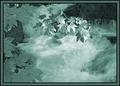
| 05/31/2003 10:50:59 PM |
Pensiveby AaronComment: Nice job making a portrait usinf a "cold" color...I think it's harder to make look good. |
| 05/31/2003 10:49:02 PM |
|
| Photographer found comment helpful. |
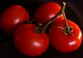
| 05/30/2003 02:53:50 AM |
Tomato On The Vineby STEINRComment: I suspect that on the photographer's monitor (as on mine) those tomatoes look predominantly red, not orange, nicely complementing the green stems, a true compliment to their ability to control the lighting and exposure.
I guess we must start a forum thread about the exact wavelength/RGB values demarcating the boundary between red and orange. However, since I myself am red/green color-blind (see my entry) I will recuse myself from that discussion... |
| Photographer found comment helpful. |
| 05/28/2003 04:34:46 PM |
Cosmic Bowlingby AnachroniteComment: In line with the other comments, try cropping just below the logo on the ball-return -- I think it makes a much stronger image. |
| Photographer found comment helpful. |
| 05/27/2003 07:27:17 PM |
Intrigue_21702-pdm-whtype.jpgby GeneralEComment: Originally posted by Diversq:
Cool I see what you mean. What a difference that makes. Im still a newbie when it comes to photography and even newer still when it comes to photoshop. Thanks for the instruction and ideas. |
You're most welcome -- it's kind of fun to try and work with something other than my own stuff sometimes...
If you just remember to use layers and save often, you can experiment away non-destructively and in different combinations and have a lot of fun! |
| 05/26/2003 08:51:15 PM |
Evolve by VipermikeComment: I could copy this if I had one of those hand-held computers... |
| 05/26/2003 07:54:50 PM |
Rise Aboveby paganiniComment: Regardless of the mat color, that's a very nice digital framing job -- good overall presentation. I think your exception to the "level horizon rule" is effective here. |
| 05/26/2003 01:45:58 AM |
|
| Photographer found comment helpful. |
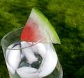
| 05/25/2003 08:53:50 PM |
ATwist on a Twistby BJComment: Not only a pretty good picture but looks like a pretty refreshing recipe as well... |
| Photographer found comment helpful. |
Home -
Challenges -
Community -
League -
Photos -
Cameras -
Lenses -
Learn -
Help -
Terms of Use -
Privacy -
Top ^
DPChallenge, and website content and design, Copyright © 2001-2026 Challenging Technologies, LLC.
All digital photo copyrights belong to the photographers and may not be used without permission.
Current Server Time: 06/21/2026 06:21:53 PM EDT.