| Image |
Comment |
| 06/10/2003 02:50:38 AM |
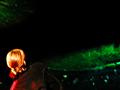
Mobile Homeby simkinComment: I'm wondering if a better "compromise" to the anonymity problem would be to crop the guy out entirely. Most DPC members have a stereotypical image of a homeless person they can use to mentally fill in the scene. It would save the awkwardness of cutting off his head, and, as you said, the subject is his home.
If you crop just at the rightmost corner of the big red bucket, you'll just have a bit of his sleeve and his right shoe in the image. It might also help compensate for the blur, by making it look like (if it isn't) a motion blur of the cart entering the frame from the right.
It's a great capture, worth continuing to work with. |
| 06/09/2003 12:27:17 PM |
Manitobaby salparadiComment: This is a case where a title pointing people in the right direction, since there is so little detail in the photo it makes it hard for people to understand the context.
Something like "Crescendo" or "First Notes" or even "Sound Check" (no one would know it's not the band's mixing engineer) might have helped people along.
I liked the color and form as a semi-abstract, but people have so little time to vote here (well, some people) that if your subject and its connection to the challenge is not obvious, your score will probably suffer (I speak from experience). But don't let that stop you from submitting things that YOU are happy with! |
| 06/08/2003 05:23:55 AM |
Note of Dby KneeforuComment: Probably what I should have done, but I did something a little different. |
| 06/08/2003 05:22:34 AM |
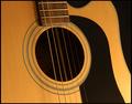
Classicby byetkoComment: Wish the upper-left of the bridge wasn't quite so bright. |
| 06/08/2003 05:17:51 AM |
|
 Photographer found comment helpful. Photographer found comment helpful. |
| 06/08/2003 05:16:48 AM |
EQby rickhd13Comment: I almost tried something like this ... need to bump up the highs a bit. |
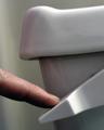
| 06/08/2003 05:14:43 AM |
Flushhhhh!by macoxComment: Well that's about the most tasteful toilet art I've seen on the web, but I wish it didn't look like it has become unfastened and you're tipping it over. |
| 06/04/2003 06:12:19 PM |
Booh !by ewebComment: What's really funny is that its coloring is kinda like my profile photo .... |
| Photographer found comment helpful. |
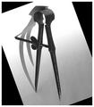
| 06/02/2003 02:11:00 PM |
Shadow Danceby autoolComment: The shape of the shadow (and time of year) makes me want to re-title this "Senior Prom."
I think I agree about either bringing out detail in the divider (screw threads), or get rid of the specular highlight and let it also be a soft, gray, semi-silhouette (shadow-like). Maybe take another version and spot-edit those highlights out to see.
Without messing with it I can't tell if rotation would help -- I think you got the "point" across pretty readily. |
| Photographer found comment helpful. |
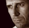
| 06/02/2003 01:10:49 PM |
Introspectiveby ToddhComment: Really good job -- I want to try your duotone color scheme sometime. |
| Photographer found comment helpful. |
Home -
Challenges -
Community -
League -
Photos -
Cameras -
Lenses -
Learn -
Help -
Terms of Use -
Privacy -
Top ^
DPChallenge, and website content and design, Copyright © 2001-2026 Challenging Technologies, LLC.
All digital photo copyrights belong to the photographers and may not be used without permission.
Current Server Time: 06/21/2026 04:46:08 PM EDT.