| Image |
Comment |
| 07/19/2003 11:54:50 PM |
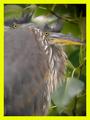
baby herons 06421_filtered.jpgby SwashbucklerComment: Great image. I'd play with the border, but I think it does have a beneficial effect of make your midtoned, grayish subjects "pop" out of the picture--rather the opposite of what people usually try and do with their typically brighter photos. You could use plain white to the same effect, but I don't usually like white borders that much myself. |
 Photographer found comment helpful. Photographer found comment helpful. |
| 07/15/2003 11:16:00 PM |
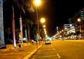
HM - It's a rotated worldby shadowComment: At least they didn't dress up the palms as barber poles ... the tilt might add a dynamic quality to a static image, or maybe just induces seasickness ... I'd be curious to compare with versions having both more and no tilt. |
| Photographer found comment helpful. |
| 07/15/2003 11:12:08 PM |
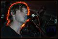
Giggby sjonniComment: Outstanding lighting control/setup or whatever .... |
| Photographer found comment helpful. |
| 07/15/2003 10:52:25 PM |
|
| 07/15/2003 10:31:12 PM |
|
| Photographer found comment helpful. |
| 07/15/2003 10:30:08 PM |
|
| Photographer found comment helpful. |
| 07/15/2003 05:26:49 PM |
|
| Photographer found comment helpful. |
| 07/15/2003 05:22:45 PM |
|
| Photographer found comment helpful. |
| 07/15/2003 05:14:39 PM |
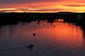
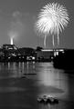
night on the lakeby zazuoComment: That palm frond in silhouette adds uniqueness and contrast to an already good fireworks shot. |
| 07/13/2003 05:28:27 PM |
|
Home -
Challenges -
Community -
League -
Photos -
Cameras -
Lenses -
Learn -
Help -
Terms of Use -
Privacy -
Top ^
DPChallenge, and website content and design, Copyright © 2001-2026 Challenging Technologies, LLC.
All digital photo copyrights belong to the photographers and may not be used without permission.
Current Server Time: 06/21/2026 07:48:39 PM EDT.