| Image |
Comment |
| 12/29/2003 12:48:24 AM |
|
 Photographer found comment helpful. Photographer found comment helpful. |
| 12/29/2003 12:44:21 AM |
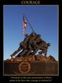
Courageby DJLubaComment: Good use of a familiar symbol; good lighting, exposure, and color scheme. It's a little odd having the quotation on the monument readable, since it's different from your caption. In this one case, I might have considered blurring the type on the monument slightly. |
| Photographer found comment helpful. |
| 12/29/2003 12:39:48 AM |
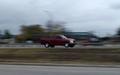
Panningby MusicmanComment: Maybe this will motivate me to work on this technique -- I have a couple of good flying bird shots in the last month. |
| Photographer found comment helpful. |
| 12/29/2003 12:38:20 AM |
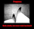
Progressby kncoughlinComment: Perspective distortion (?) on the right bothers me some. I might have tried cropping a square out of this, and put it on a vertical layout with two lines of type below, maybe shortening it to
Walk Slowly,
But Never Backwards |
| Photographer found comment helpful. |
| 12/29/2003 12:35:21 AM |
Imagine... by JasperComment: A beautiful image and presentation. I think more black at the bottom and moving the type down would make it a more traditionally poster-shaped. |
| Photographer found comment helpful. |
| 12/29/2003 12:32:17 AM |
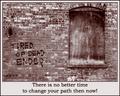
Tired of Dead Ends?by TooCoolComment: I glad to se some people using "non-pretty" pictures; this is appropriately "gritty" for your topic. For some reason the inner, light border by the brick bothers me a little, maybe because it almost but doesn't quite mimic the mortar lines. I'd like to see this with the inner black border touching the bricks.
Also, you have a typo or syntax error -- the next-to--last word should be "than" (but I don't deduct for typos!). |
| Photographer found comment helpful. |
| 12/20/2003 09:04:02 PM |
|
| Photographer found comment helpful. |
| 12/20/2003 08:55:23 PM |
|
| Photographer found comment helpful. |
| 12/20/2003 08:52:28 PM |
|
| 12/18/2003 05:02:56 PM |
Simple Pleasuresby CamComment: Originally posted by wkmen:
I laughed when I saw this photo, and laughed a little more when I wrote my original comment. But I was just cracking up big time reading all of the comments below. Hilarious! And you started it...how did your model keep a straight face? |
Ditto. Hope your GF has recovered ... |
| Photographer found comment helpful. |
Home -
Challenges -
Community -
League -
Photos -
Cameras -
Lenses -
Learn -
Help -
Terms of Use -
Privacy -
Top ^
DPChallenge, and website content and design, Copyright © 2001-2026 Challenging Technologies, LLC.
All digital photo copyrights belong to the photographers and may not be used without permission.
Current Server Time: 06/23/2026 05:53:06 AM EDT.