| Image |
Comment |
| 07/06/2004 11:26:05 PM |
Sunrise Panoramaby GeneralEComment: Originally posted by joanns:
I have always wanted to capture sun rays like this but I never see them when I can stop to take a photo. I really love this shot. I love the clear blue in the sky and the way the light just fans out over the horizon. Very nice. :) |
Thank you! I actually took this while driving (crawling) through commute-hour traffic!
I finally set this up as a printable image ... the image is so small I set it up like a "motivational poster" ... went searching for suitable quotations and found two ...
Dreamers ...
The Dawn of Eternal PeaceMessage edited by author 2004-07-06 23:59:31. |
| 07/04/2004 12:52:04 PM |
flirtaceous. by theodor38Comment: Given the subject's apparent interaction with someone off-camera, it seems odd to have al the negative space off in the other direction -- I'm expecting to see other people lined up at the bar or something. I think you could crop all that off into a standard vertical aspect ratio without compromising your theme at all. Lighting, exposure, focus, expression are all great. |
 Photographer found comment helpful. Photographer found comment helpful. |
| 07/04/2004 12:49:11 PM |
Samby rhipsterComment: Combination of pose and border really make the subject look "boxed-in." Makes me wonder if that's an expression of the personality of the model or the photographer. |
| 07/04/2004 12:47:06 PM |
Contemplationby waterliliesComment: I like this as a candid shot. For "portrait" (especially if "studio") I think it would be stronger if cropped to just a head nad shoulders shot, with her lips at about the lower-right 1/3-line intersection. |
| Photographer found comment helpful. |
| 07/04/2004 12:45:58 PM |
Send in the Clownsby Prime_TimeComment: Reminds me of a "backstage" shot, nice and moody. I'd have used a much darker blue or black for the outer border. |
| Photographer found comment helpful. |
| 07/04/2004 12:45:24 PM |
Daydreamby labudsComment: Nice lighting, background is OK, but I don't think the negative space above adds that much (there's maybe not enough for that) -- I think with this composition/pose you could crop to a square and have a stronger "portrait" photo. |
| 07/04/2004 12:44:43 PM |
Didiby RoosterComment: I like the tones and textured background. I would try a little tighter crop than this. |
| Photographer found comment helpful. |
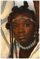
| 07/04/2004 12:43:55 PM |
Marakiby AlexysComment: Really great range of colors while staying somewhat subdued and in control. Maybe a little over-sharpened for my taste; I can see a little haloing at the points of maximum contrast around the hair and clothing, and it heightens the reflections too. I'd probably tone down the reflections with the Clone or Burn tools before printing. Very nice overall. |
| Photographer found comment helpful. |
| 07/04/2004 12:36:12 PM |
Safari Samby JackoComment: Way to control the lighting to keep the detail in the white on white areas; a fluffy white butterfly net might have been a cool accessory, or maybe "overkill." |
| Photographer found comment helpful. |
| 07/04/2004 12:27:36 PM |
Me and Myselfby artvetComment: Interesting idea, good job controlling stray reflections or glare. |
| Photographer found comment helpful. |
Home -
Challenges -
Community -
League -
Photos -
Cameras -
Lenses -
Learn -
Help -
Terms of Use -
Privacy -
Top ^
DPChallenge, and website content and design, Copyright © 2001-2026 Challenging Technologies, LLC.
All digital photo copyrights belong to the photographers and may not be used without permission.
Current Server Time: 06/24/2026 12:46:31 PM EDT.