| Image |
Comment |
| 09/02/2004 11:08:25 PM |
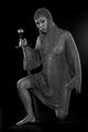
Lioness Rampantby AnastasiaComment: You know a good armorer ... I never made a piece of mail more than a few inches square. |
 Photographer found comment helpful. Photographer found comment helpful. |
| 09/02/2004 11:05:03 PM |
|
| 09/02/2004 11:02:52 PM |
|
| Photographer found comment helpful. |
| 08/27/2004 05:12:57 PM |
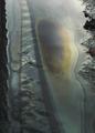
The Botanist's Viewby mrorange002Comment: Cool picture -- to be logically consistent with your title, you might consider reversing the desaturation (have the part in the lens B+W), since the "rest of us" would just see pretty flowers, while the botanist might see the structure/anatomy in a more coolly clinical manner. |
| Photographer found comment helpful. |
| 08/25/2004 10:18:59 PM |
Ant Expresswayby IsaacComment: Well, I beat you (barely) in overall placement, but I see you got three 10's to only one for me : )
I think this was somewhat under-rated (surprise!), but of course most people don't want to deal with things like literally vanishing lines which don't happen to converge in the image ... |
| 08/13/2004 04:20:52 PM |
Slick!by GeneralEComment: Originally posted by KarenB:
Paul, this is really cool too. I scored it fairly high during voting during the challenge.
Just had another thought...
Did you try to rotate it CW a bit, to give a bit of a slant to the composition? |
Thanks! I think I was trying to get the left edge straight, but I can see where a slight rotation clockwise would make the implied (but unseen) horizon straighter. I'll have to see if there's enough uncropped area to the left to try that. |
| 08/13/2004 10:51:39 AM |
|
| 08/13/2004 10:46:51 AM |
|
| Photographer found comment helpful. |
| 08/13/2004 10:43:59 AM |
Road to Denali by crabappl3Comment: Great job maintaining all the detail in clouds and snow. Must help to have a great subject "handy" -- for some reason snow-capped mountains (thankfully) haven't made it onto the DPC "Do Not Post" list : ) |
| Photographer found comment helpful. |
| 08/13/2004 10:35:30 AM |
|
| Photographer found comment helpful. |
Home -
Challenges -
Community -
League -
Photos -
Cameras -
Lenses -
Learn -
Help -
Terms of Use -
Privacy -
Top ^
DPChallenge, and website content and design, Copyright © 2001-2026 Challenging Technologies, LLC.
All digital photo copyrights belong to the photographers and may not be used without permission.
Current Server Time: 06/24/2026 06:42:46 PM EDT.