| Image |
Comment |
| 10/11/2003 06:35:37 AM |
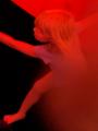
The Shadowby thelselComment: This is very powerfu image of a child's fear. But I don't like the noise you added to it. It really distracts from the shadowy feeling. (just my taste) |
 Photographer found comment helpful. Photographer found comment helpful. |
| 10/11/2003 06:33:52 AM |
Out of the darknessby tyrkinnComment: What could help this photo is a closer zoom to the subject and different cropping. There is way to much black negative space for this to be effective photo. The colours are really nice and it's pretty sharp. |
| Photographer found comment helpful. |
| 10/11/2003 06:31:35 AM |
Untitledby GraciousComment: This image looks like you accidentally pressed the shutter without knowing it, while having a finger over your lense. I don't want to sound harsh or hurt your feelings (in case you are a young child), but you should not be submitting photos if you are not sure that they are your best. In case this is your best, than I apologize. |
| Photographer found comment helpful. |
| 10/11/2003 06:19:40 AM |
bouncing soulby salparadiComment: The whole image is pixelated and out of focus. I am sure it has a great emotional value to you, but IMO it doesn't have much of an artistic value. I don't want to hurt your feelings, but it is very boring to look at. |
| 10/11/2003 06:13:15 AM |
Things that go bump in the nightby Faye PekasComment: I like the concept, but your image is to posterized and pixelated to be effective. It lacks the needed contrast between lights and darks. It doesn't look like photograph at all. Why the coloured border? It doesn't fit with the image. |
| 10/11/2003 06:11:08 AM |
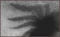
Nuclear Nightmareby GeneralEComment: I respect your vision of nuclear, but this to me doesn't portray it. Your image is very pixelated and grainy. Your border is greenishgrey - make it black to be more effective. I don't want to hurt your feelings, but this is just not very interesting to look at. |
| Photographer found comment helpful. |
| 10/11/2003 06:08:39 AM |
Out of the mist of my dreamby neenee1999Comment: I know you tried for a misty look, but the whole image lacks contrast which makes it harder to look at. The lady also looks like half laughing - her eyes give her away. She doesn't look scared. Are you using too much compression? - the image is pixelated and grainy. |
| Photographer found comment helpful. |
| 10/11/2003 06:05:36 AM |
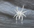
A Living Nightmareby christyrackComment: Concept and idea is very good, but the image suffers from serious pixelation problem. The texture looks nice but because it is pixelated, you loose most of it. Also the spider is too centered (it is only slightly off centre but not enough for it to work). The whole shot could also use a contrast adjustment. |
| Photographer found comment helpful. |
| 10/11/2003 06:01:47 AM |
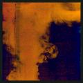
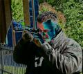
Deranged DPC Photographer on the Looseby OneSweetSinComment: Funny. I got your joke, but I do not like the colour treatment of this (just my taste). The whole image could be rotated clockwise to adjust that it's leaning towards the laft. It is also too centred for this to be effective. It looks really like a quick snapshot of someone with fancy colour-channel work. Sorry. |
| 10/11/2003 05:58:45 AM |
Alone On a Deserted Islandby alternaruleComment: As you title suggests, there somehow should be a person in this shot. Your photo has a nice abastractiveness to it. Lovely blue colour - too bad the sand is not more oringy to give contrast to the blue. Love how it sparkles, but it could be more in focus (the whole image is a bit pixelated). |
Home -
Challenges -
Community -
League -
Photos -
Cameras -
Lenses -
Learn -
Help -
Terms of Use -
Privacy -
Top ^
DPChallenge, and website content and design, Copyright © 2001-2026 Challenging Technologies, LLC.
All digital photo copyrights belong to the photographers and may not be used without permission.
Current Server Time: 06/23/2026 02:59:47 AM EDT.